Run Workout App
Simplifying Workout Discovery for Community Runners
The Challenge
As a coach for a 15-person running club, I kept watching members get overwhelmed by fitness apps built for serious athletes — dozens of features upfront, dense menus, no easy way to just find or share a simple workout — in a global running app market worth $1.2B+ and growing 14.2% annually. The opportunity was a focused tool that does one thing well: help runners quickly discover workouts and easily share their favorites.
Project Context: Personal design exploration | Duration: 2 months | Role: Solo UX designer
My Approach
I ran informal interviews with 3 club members and surveyed 5 more. Three things stood out: casual runners wanted simplicity over features, they trusted a workout more when they knew who made it and why, and they wanted 3-4 quick filters, not an exhaustive search form.
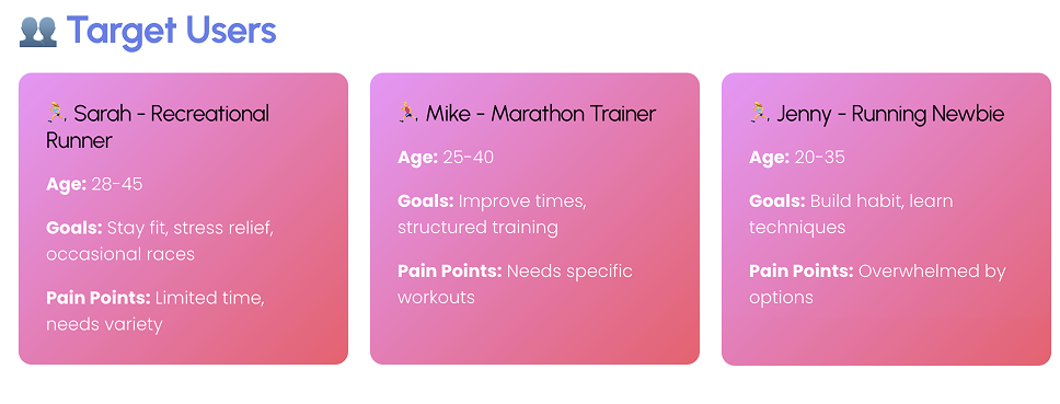
That research pointed to three user types: the new or comeback runner who needs confidence-building, beginner-friendly defaults; the social runner who trusts peer recommendations over algorithms; and the experienced contributor who wants to share knowledge through a dead-simple, sub-5-minute publishing flow.
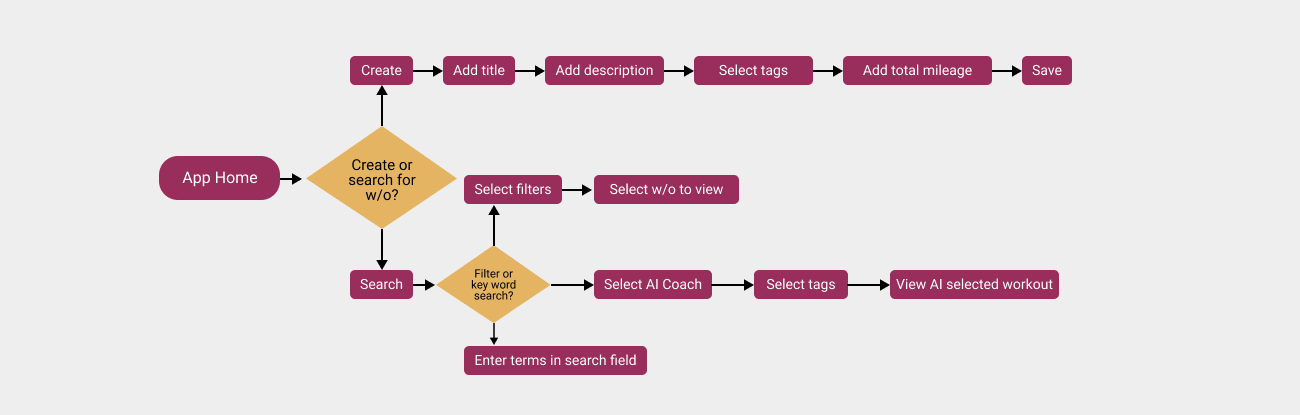
The biggest early decision was browse-first entry: no login required to view or filter workouts, with account creation only needed to save or contribute. That got 3 of 3 test users browsing workouts within 30 seconds, versus 2+ minutes of onboarding on competitor apps.
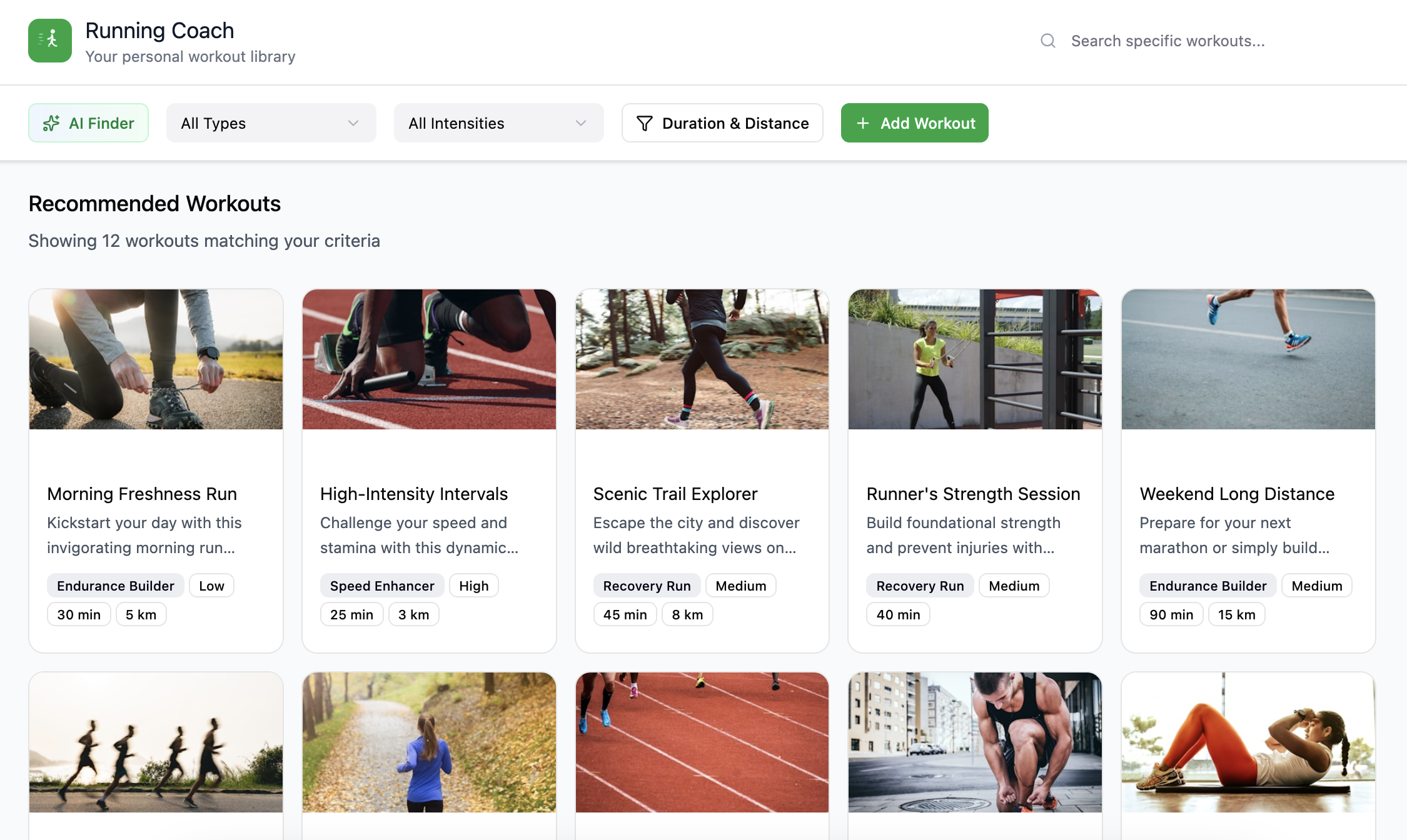
Early testing also showed users bouncing between keyword search and filters, unsure which to use, so I merged them into one unified search with filter chips underneath. That cut discovery time from 3:15 to 1:45 minutes, a 45% improvement.
Every AI recommendation carries an explicit "Recommended because:" explanation instead of a black-box suggestion, so users understand and trust the system rather than feeling manipulated by an invisible algorithm.
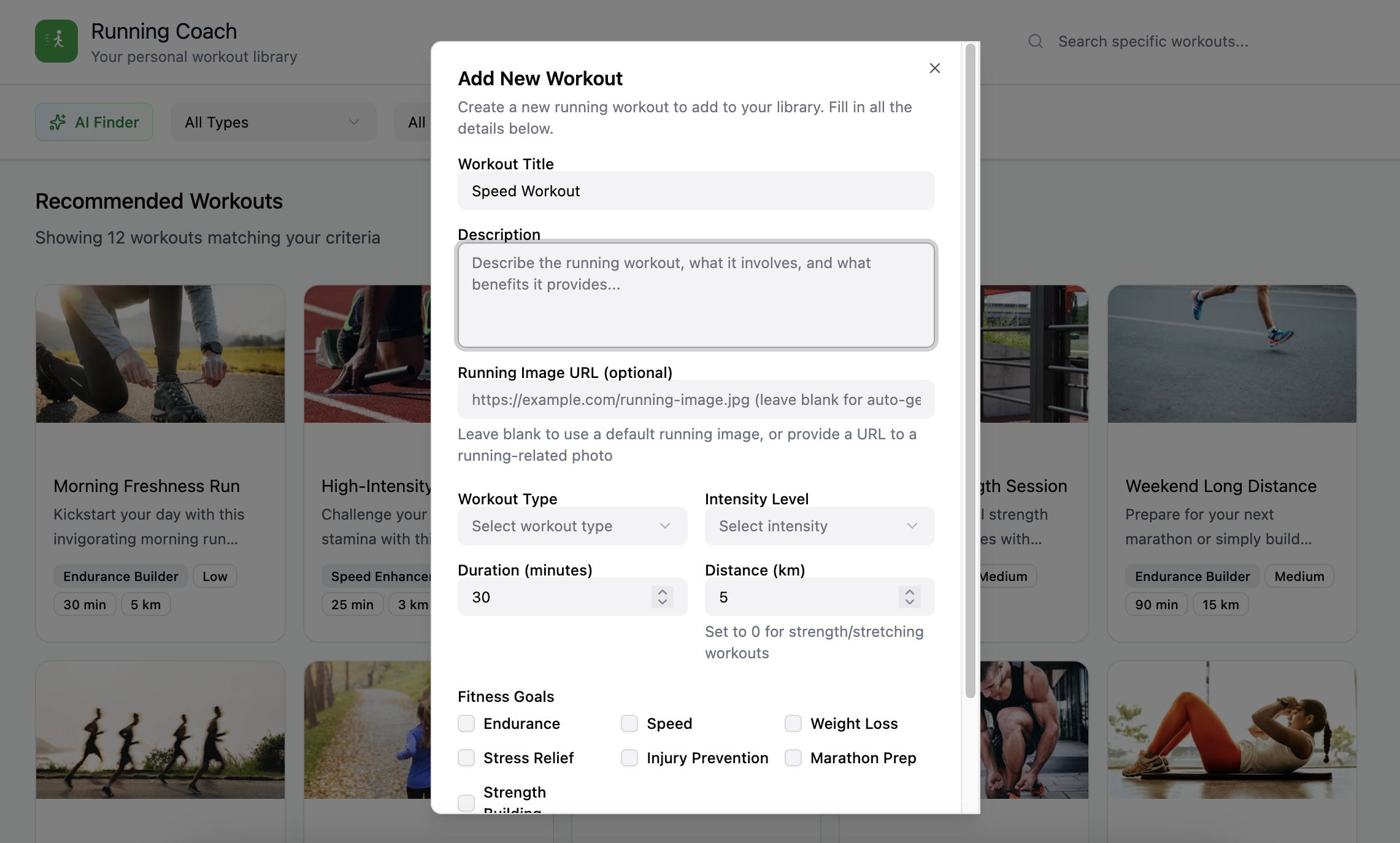
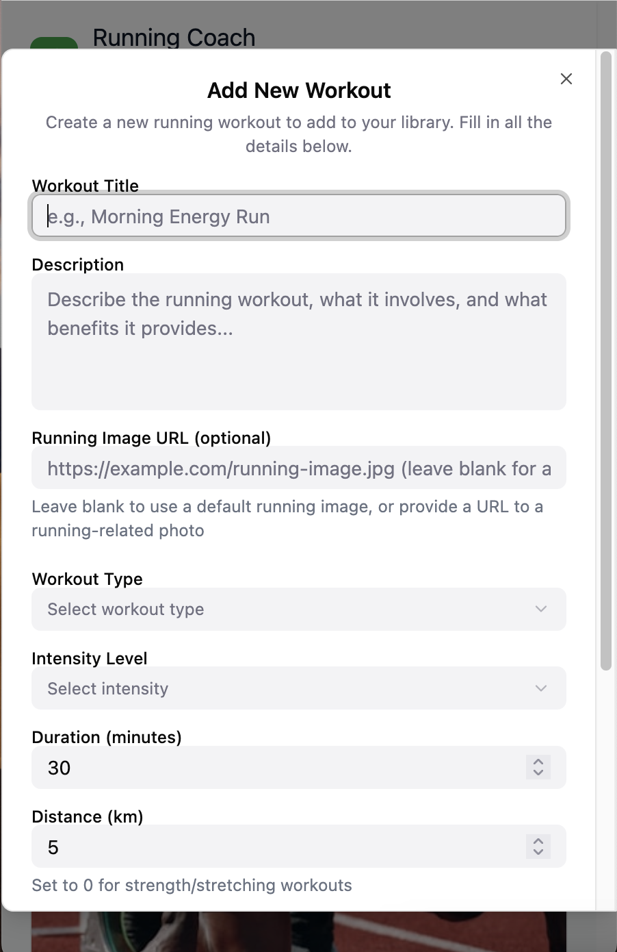
Two more changes rounded things out: a multi-signal difficulty system (label + icon + pace range) that got users choosing the right workout 95% of the time, up from 60%, and a single-page contribution form with autosave that cut publishing time from 8 minutes to 4.
Design Solution
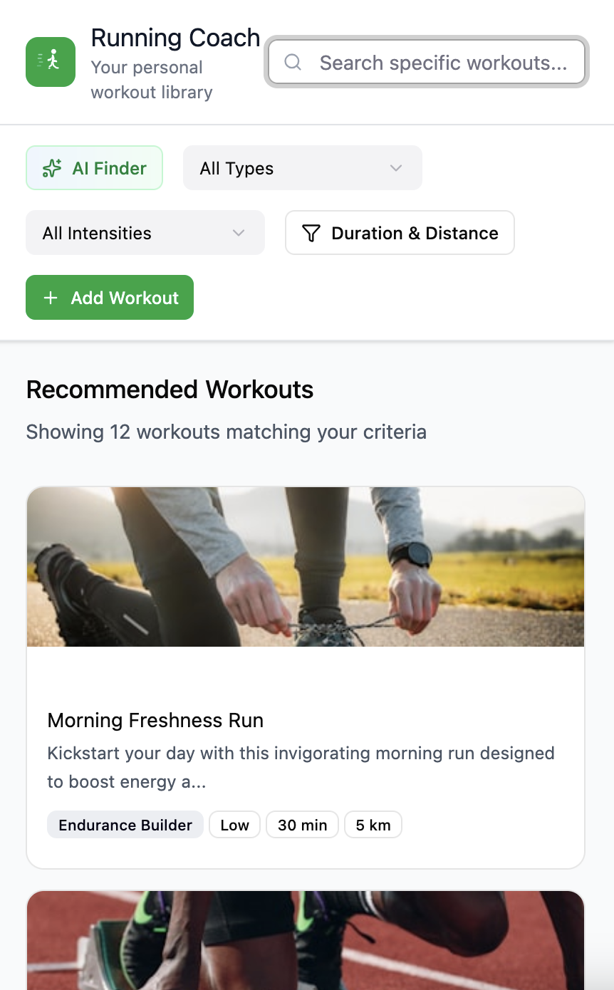
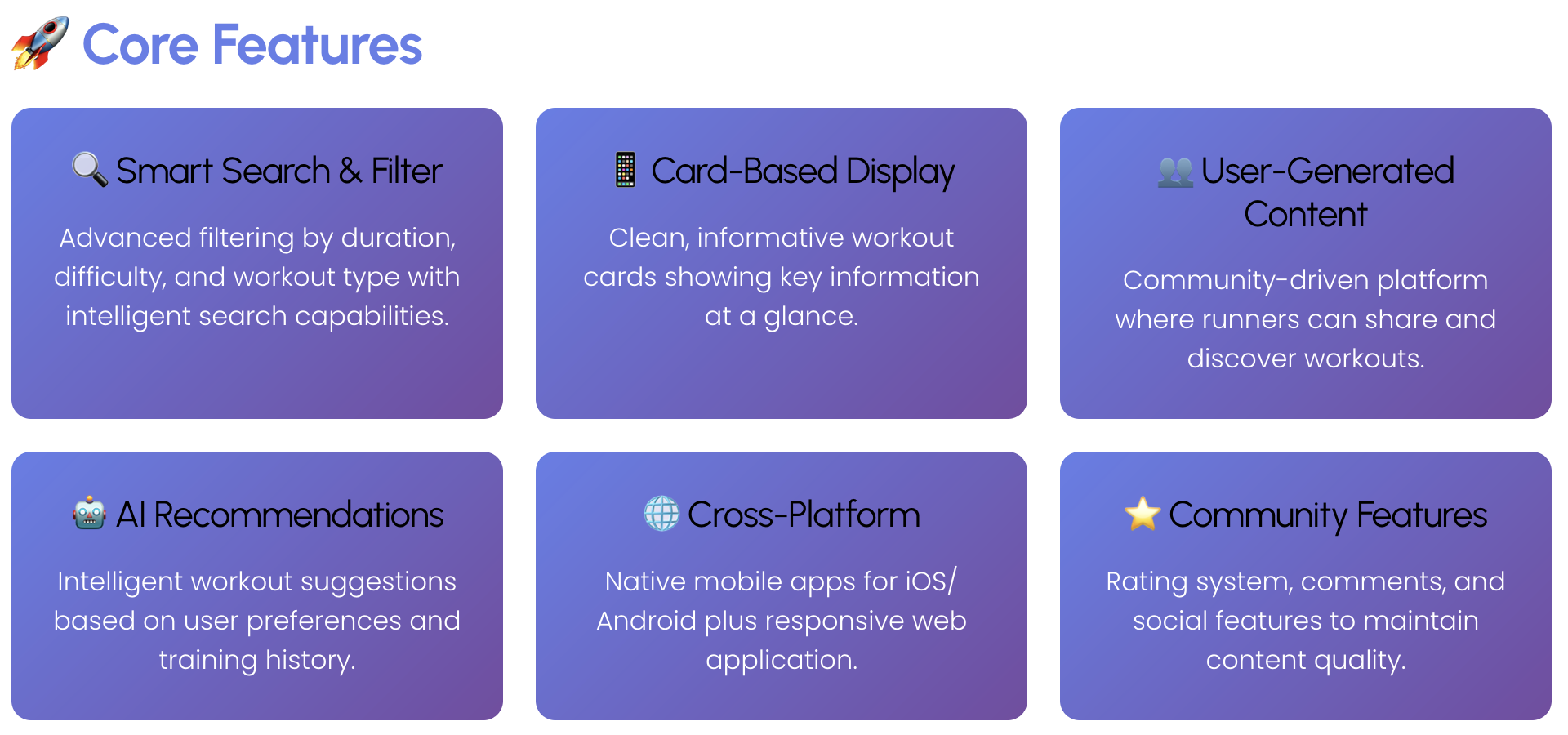
The app is organized around three views: Discover for browsing and filtering the library, My Workouts for saved favorites and history, and Contribute for publishing and managing your own workouts, with a bottom tab bar on mobile and top navigation on desktop.
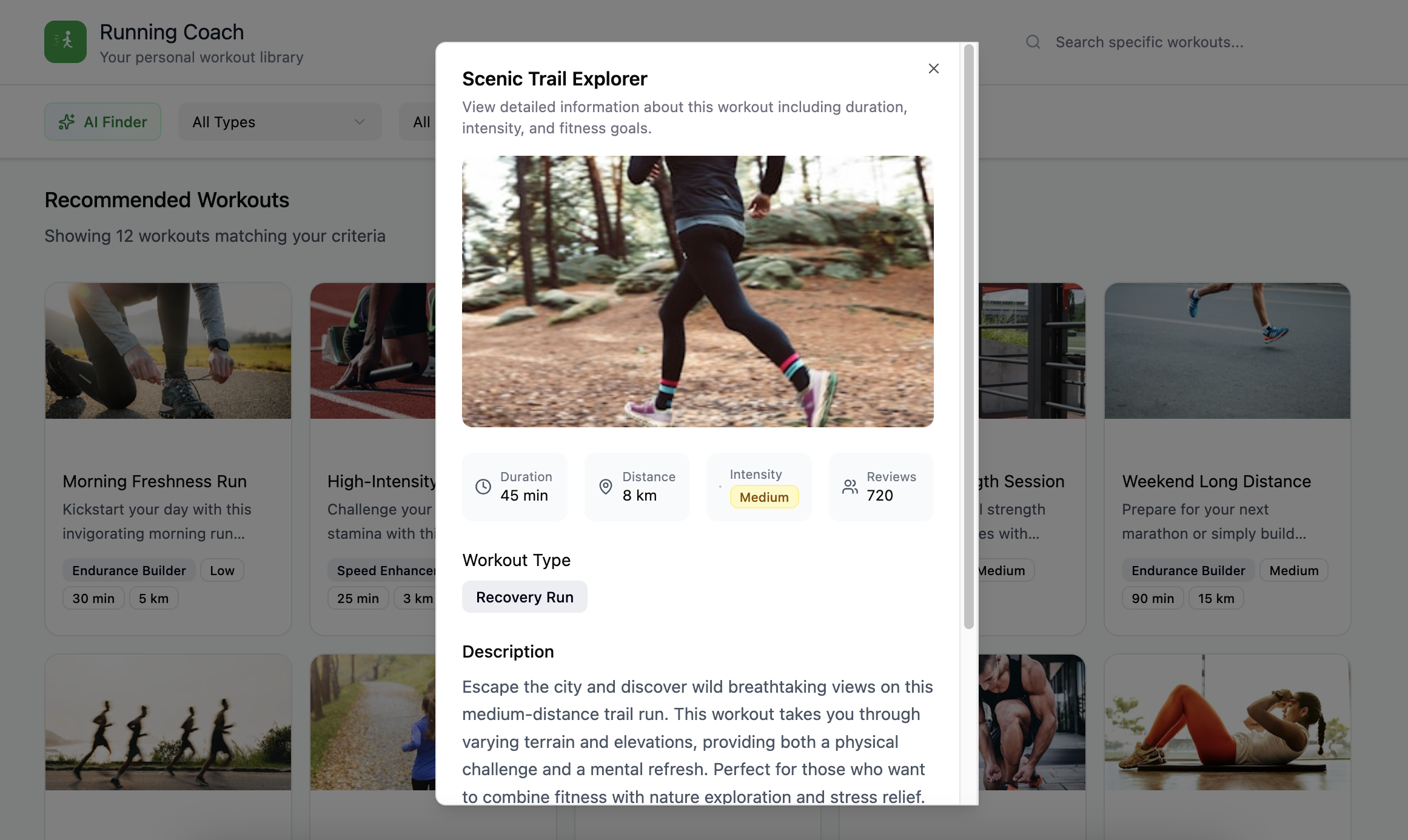
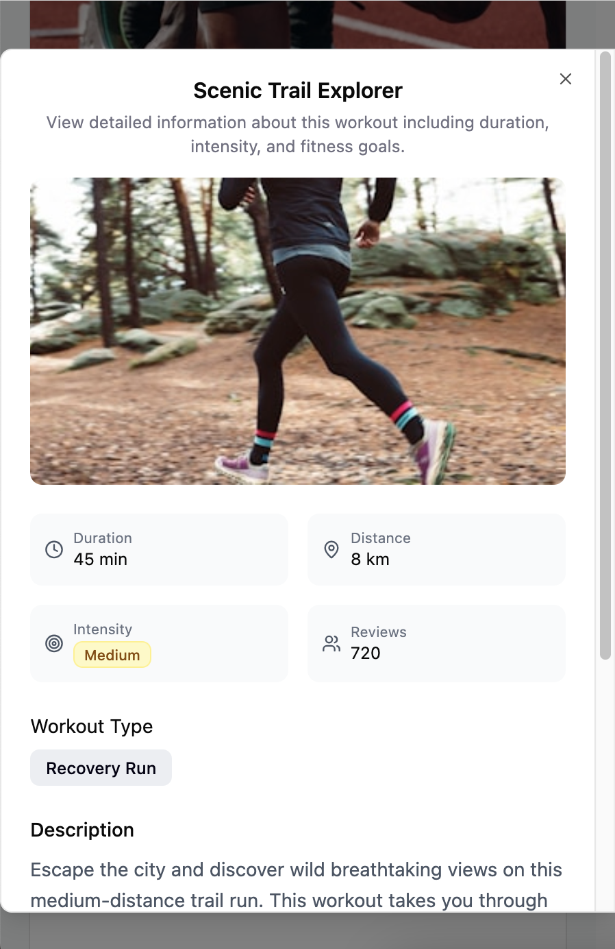
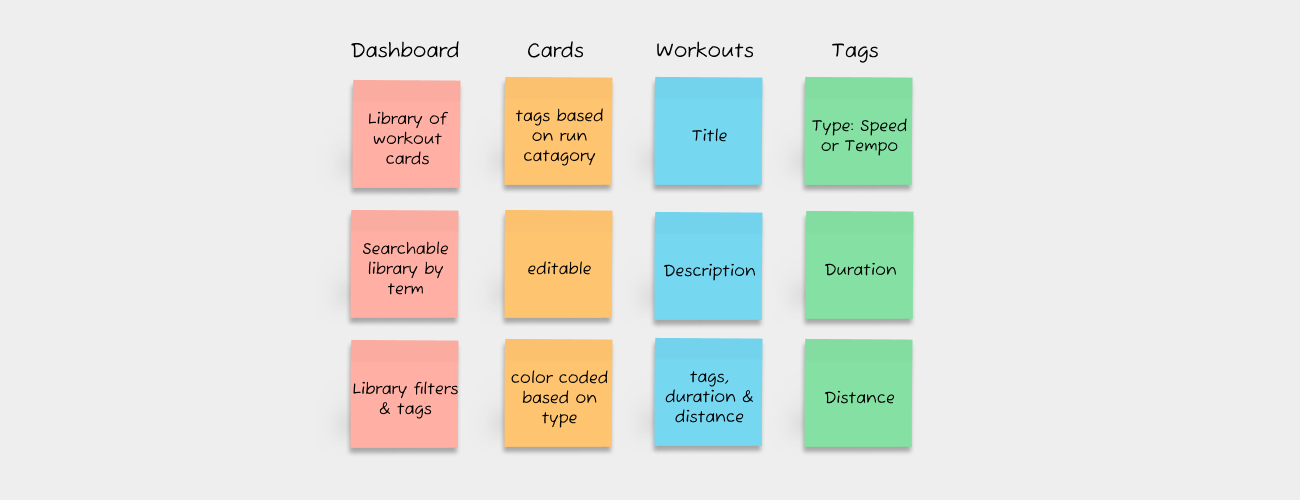
Each workout card leads with title, distance, difficulty, and contributor identity, with more detail available on tap.
AI recommendations sit in their own section below the filters, capped at three at a time, each one carrying its "Recommended because" explanation and a one-click way to see something else instead.
Testing & Iteration
I tested the prototype with 5 runners across two rounds. The sharpest issue in round one was the same search-vs-filter confusion from earlier research — users tried keyword search first, then abandoned it for filters — which confirmed the unified search decision was worth doubling down on. I also added a confirmation screen after publishing, since round-one testers had no idea their workout had actually gone live. A second round validated the fixes across every core flow.
Design Outcomes
Final testing validated the redesign: 100% task completion across all core flows, 45% faster workout discovery, 50% faster contribution, and a 5/5 "easy to use" rating from testers.
Design Patterns Created
Reusable Solutions:
- Unified search + filter interaction pattern
- AI transparency explanation component
- Single-page form with live preview
- Multi-signal difficulty communication system
Designing with AI
AI as Enhancement, Not Requirement. The app works perfectly well without AI recommendations — I started with simple rule-based matching and left room to layer smarter learning on top, rather than forcing complexity in from day one. I used AI tools like Visily and Figma Make to move fast on initial concepts, but the craft still came from the refinement and testing after.
Transparency Builds Trust. Users don't inherently distrust AI, they distrust opacity — explicit "why" explanations eliminated skepticism and got people actually engaging with recommendations instead of ignoring them.
Running App Screens