Connection Indicator Component
Kessel Run - US Air Force Software
I led design and implementation of a standardized connection indicator component across 7 Air Force applications, replacing inconsistent, app-specific indicators with one reusable pattern now adopted throughout the design system.
Key Outcomes:
- 75% reduction in connection-related support tickets
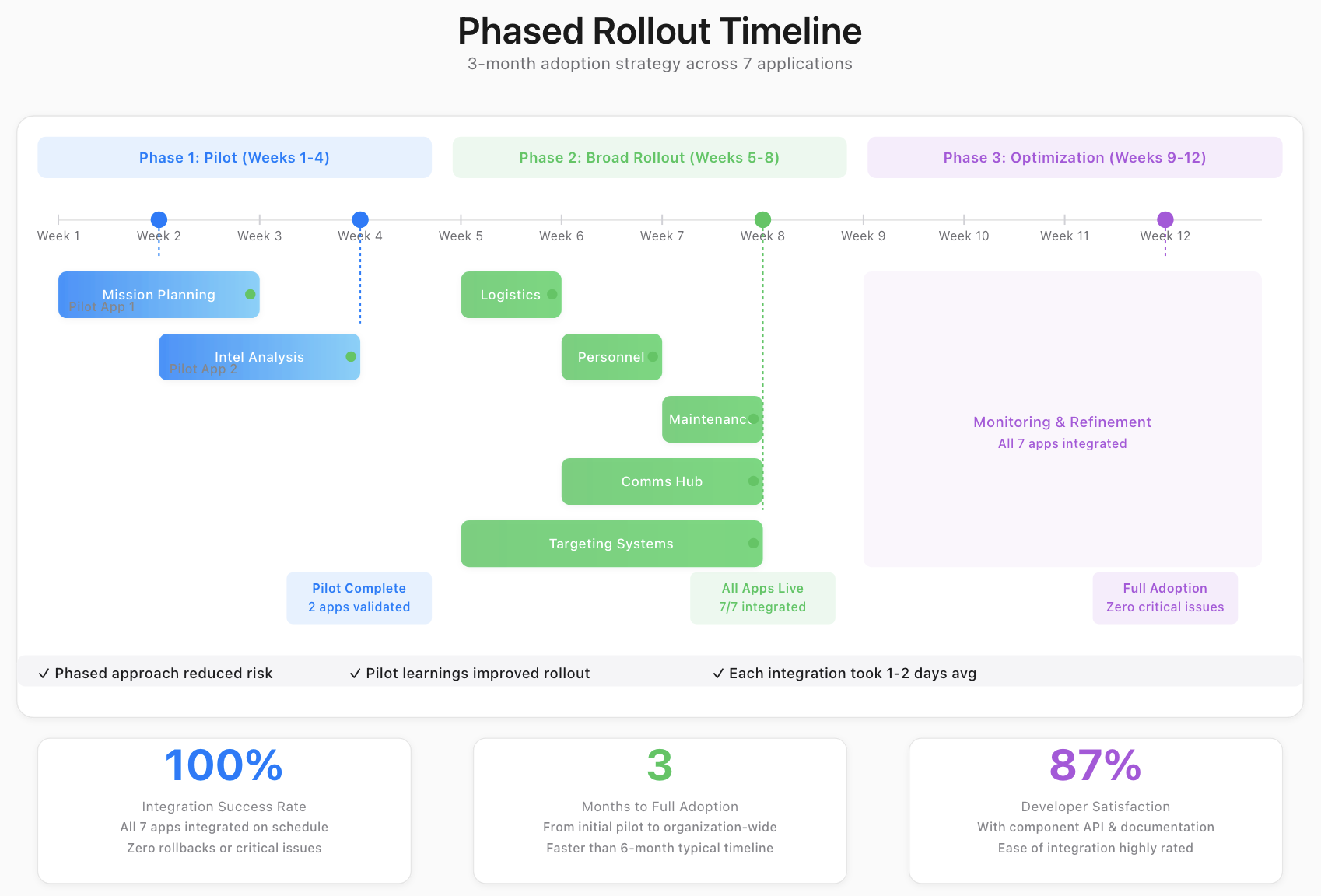
- 7 applications successfully integrated the component in 3 months
- User satisfaction improved 28% in post-deployment surveys
The Problem
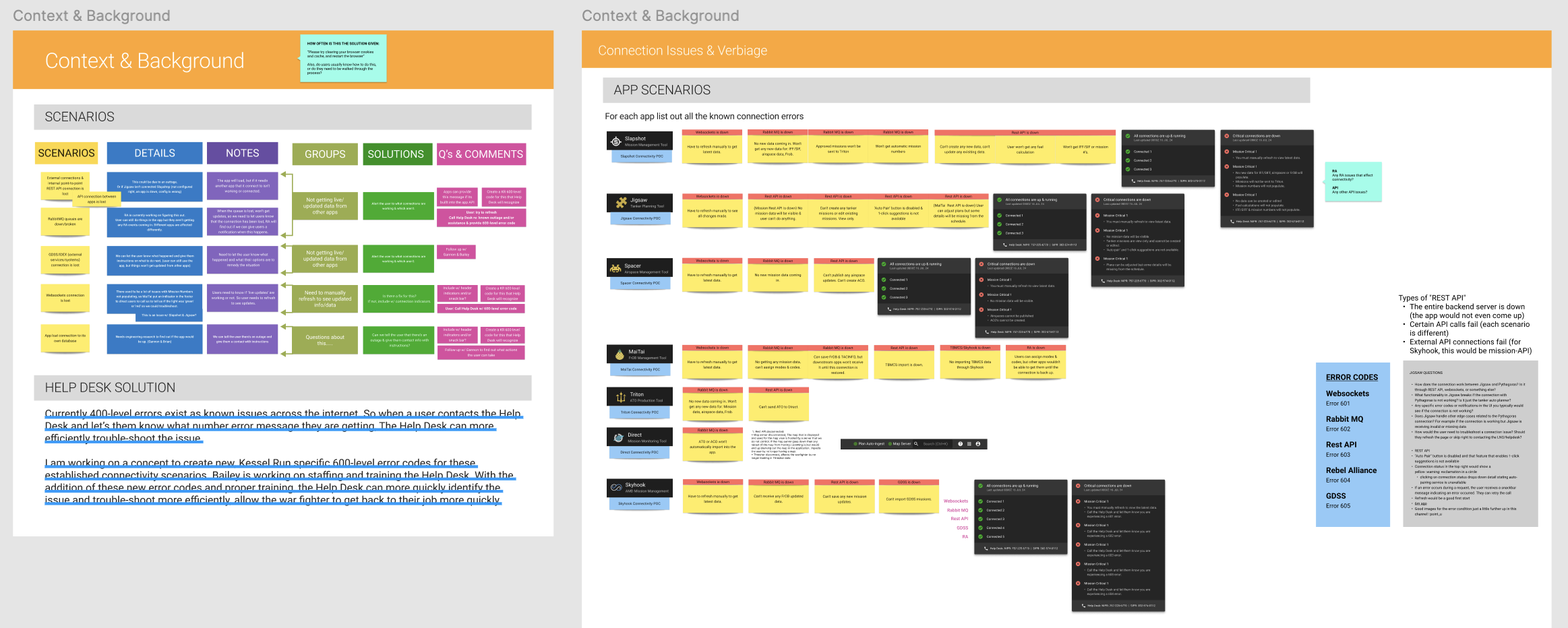
Warfighters using our mission-critical software suite couldn't tell whether the data in front of them was current or stale — seven applications each displayed connection status differently, or not at all. As one put it, "I don't know if I'm seeing live data or if my connection dropped," and another: "I make mission-critical decisions on this data, I need to know it's current."
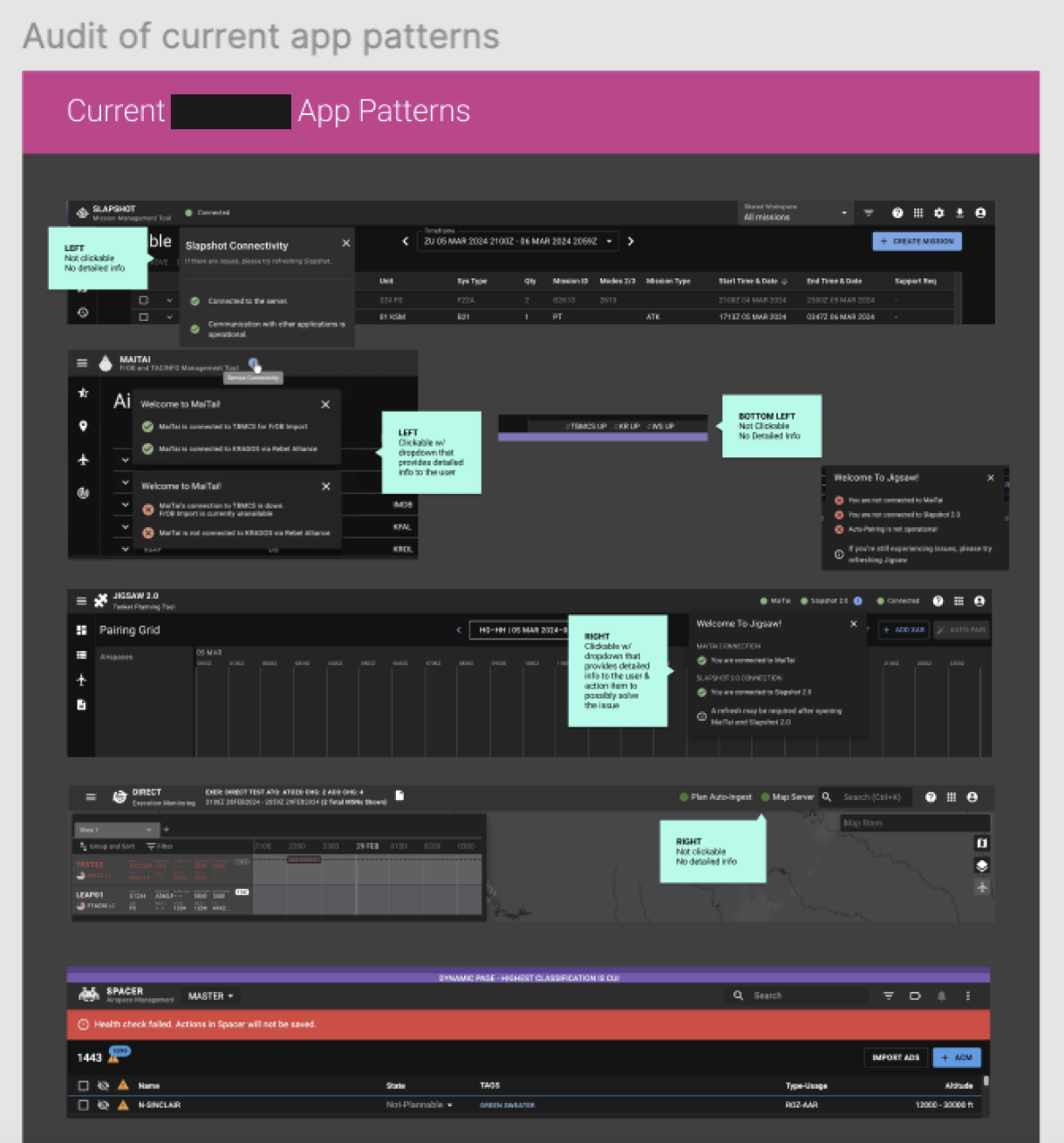
The confusion showed up in the numbers too: 20+ monthly support tickets across the 7 apps, each averaging 45 minutes to resolve. The technical picture was just as fragmented — apps had different connectivity requirements (real-time vs. periodic sync), some needed offline functionality with sync queues, and the 5 apps that already had some kind of indicator had each built it differently.
My Approach
Phase 1: Research & Discovery
I assembled a cross-functional working group — all 7 product teams, backend engineers, warfighters, and security — and ran interviews with 12 warfighters plus analysis of 50+ support tickets. The insight that shaped everything: users needed to understand what connection status meant for their specific workflow, not just binary connectivity.
Key Decision: Framed the problem around context-specific needs (warfighter needs current targeting data, analyst needs latest intel updates) rather than generic connection indicators. This insight drove all subsequent design decisions.
Phase 2: Collaborative Design
I partnered with the dev team from day one to map backend constraints, then tested three design directions with 8 warfighters. The winner — icon + color + text label — hit 94% accuracy versus 62% for icon-only, so I built it as a three-tier progressive-enhancement system (Basic, Enhanced, Advanced) letting every app integrate at whatever level its backend supported, rather than forcing a one-size-fits-all build.
Phase 3: Development Partnership
I documented the component's API, visual specs, interaction behavior, and edge cases, then held daily office hours during the 3-month rollout to support all 7 teams. When one team's backend couldn't distinguish "poor connection" from "timeout," I combined those states with clearer messaging rather than forcing a technical fix — between the documentation and real-time support, teams integrated the component in an average of 2 days versus the previous 2-week timeline.
Design Solution
Component Architecture
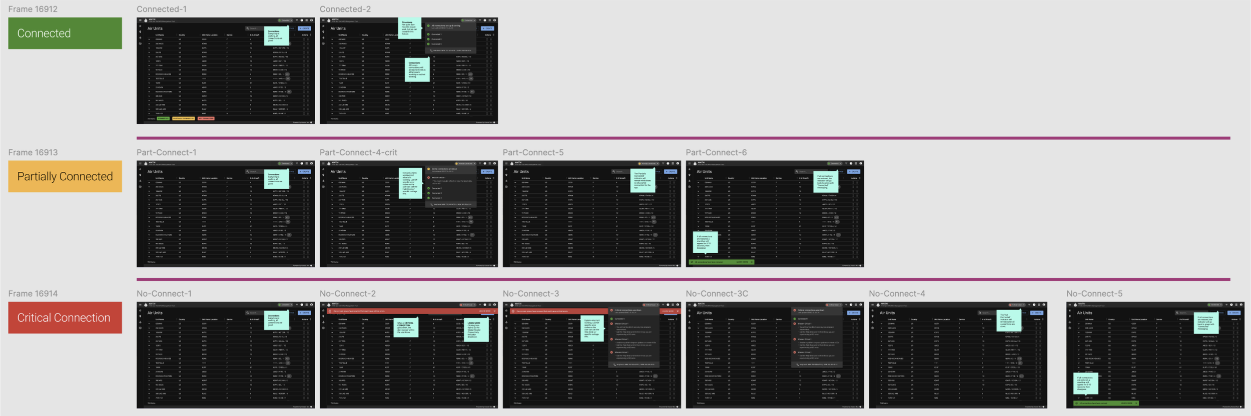
Three connection states, always differentiated by color, icon, and text label together, never color alone: Connected (green) tells users their data is live; Partially Connected (yellow, with a subtle reconnecting animation) tells them the app is retrying and showing cached data; and Critical Connection (red, with a last-synced timestamp) tells them they're fully offline.
Visual Design Decisions
I placed the indicator in the application header, top-right — testing showed 95% discoverability there versus 62% for footer placement. Color mapped to familiar mental models (green/yellow/red) but never carried meaning alone: every state paired a WCAG AA-compliant text label, verified with colorblind simulation, with a subtle pulse animation that drew attention only when the state actually changed.
Collaboration & Leadership
I led collaboration across all 7 product teams and mentored a junior designer on component variants for the next phase. Not every team prioritized integration at first, so I showed them their own support-ticket data, demoed the improved experience, and offered hands-on implementation support — that secured commitment from all 7 teams within 2 weeks.
Backend teams each had different connectivity architectures, so I ran a technical design session to find common ground and built a flexible component API that adapted to all 7 without breaking consistency. Once it was in the centralized Figma library with full documentation, integration time for new apps dropped from 2 weeks to 2 days, and the component became the template for every status indicator that followed.