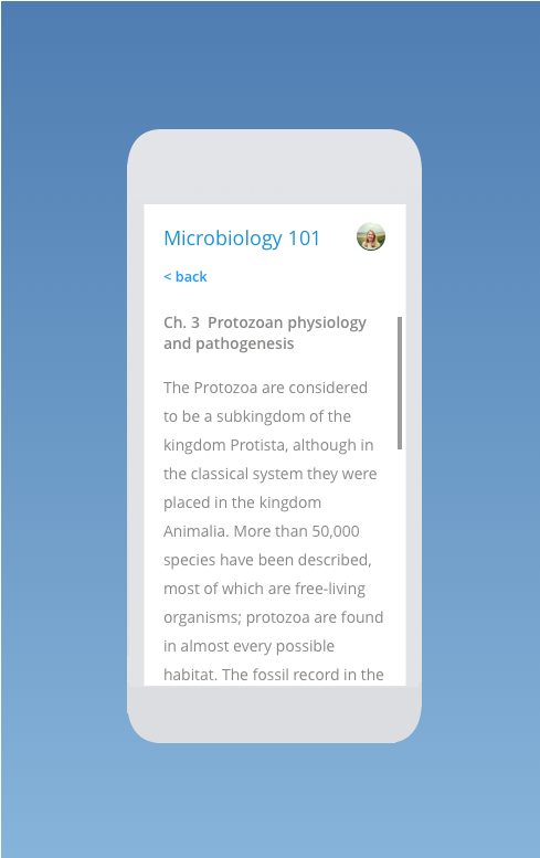
Student Dashboard & Course Screens
Reducing Cognitive Overload in Online Learning
The Challenge
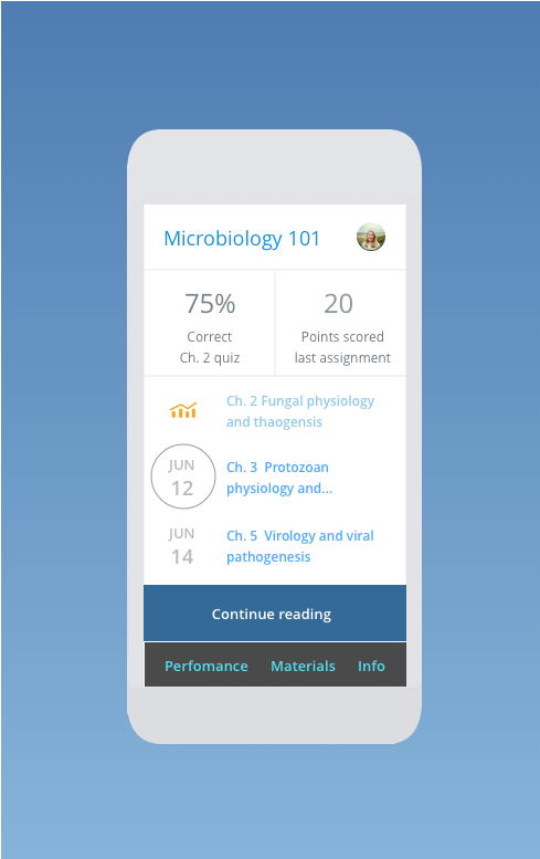
I designed a student-facing dashboard for Pearson's higher-ed platform that consolidates scattered course materials, assignments, and resources into one prioritized view that adapts to each student's progress. The existing dashboard showed every assignment at once regardless of due date, buried materials in separate sections from the assignments that referenced them, and gave every student an identical view with no sense of what mattered right now.
"I just want to see what's due this week, not everything for the entire semester."
My Approach
Research
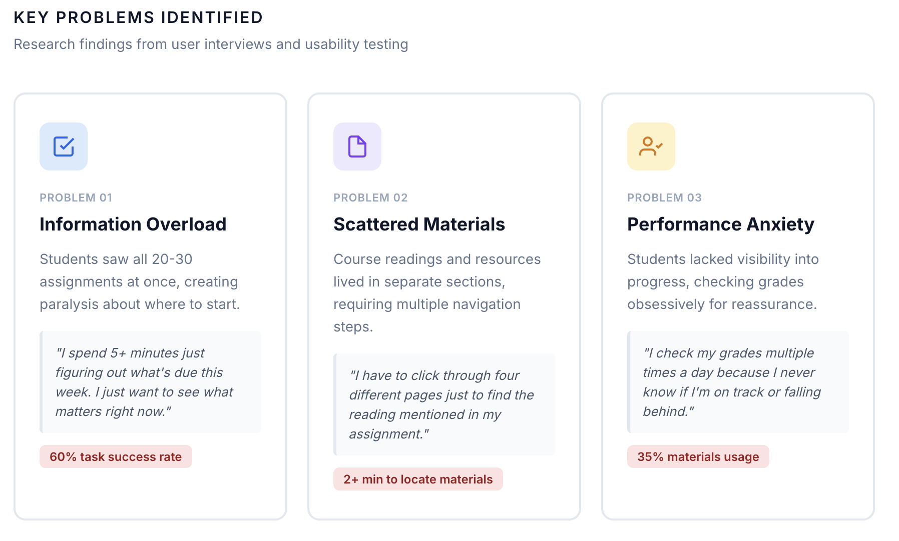
I interviewed 6 undergraduate students across different majors about how they navigated coursework. Three findings stood out: students wanted a prioritized view instead of a comprehensive list, they were losing focus jumping across 4 separate pages just to open one assigned reading, and many checked their grades obsessively because they had no reliable signal of where they stood.
Progressive disclosure for assignments
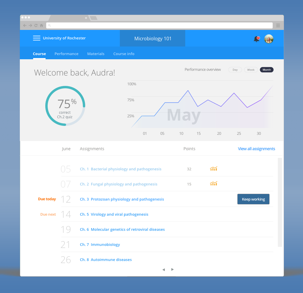
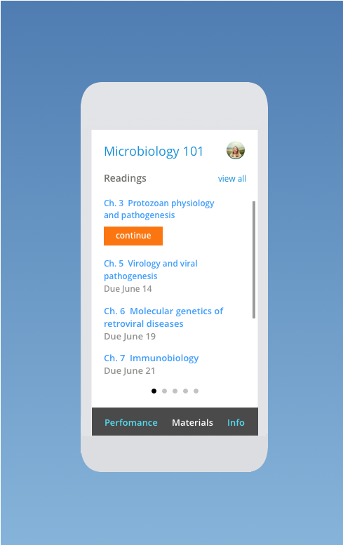
Showing all 20-30 assignments at once made it hard to know where to start, so I redesigned the default view to surface only recent and upcoming work, color- and size-coded by priority, with the full list available behind a single expand action for anyone who needed it.
Contextual material integration
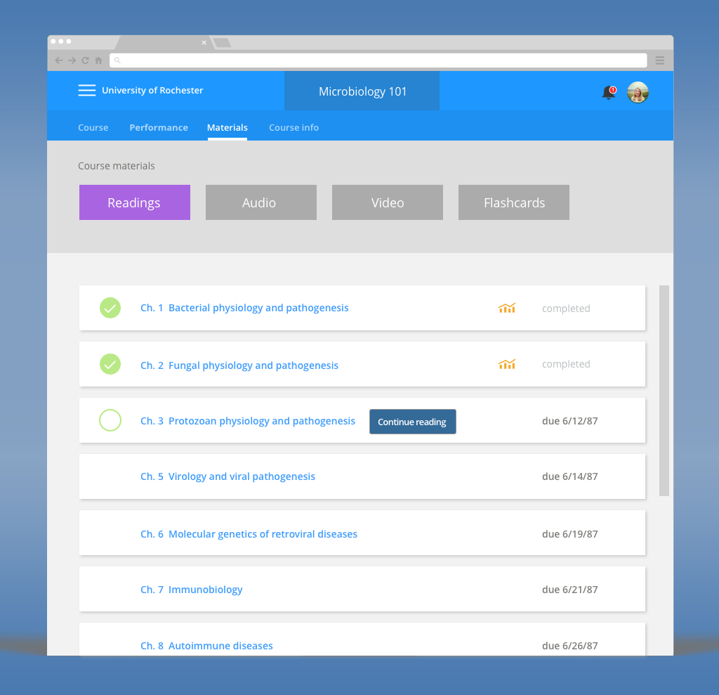
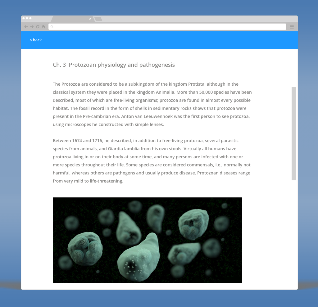
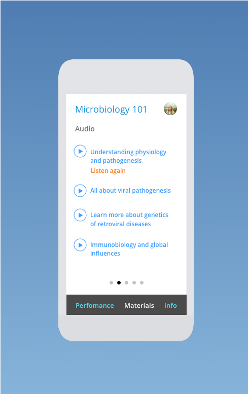
Materials lived in a separate section from the assignments that referenced them, so students bounced across multiple pages to open one reading. I moved required materials directly into the assignment detail view, with completion indicators and quick links to related materials in other courses.
A personalized, adaptive dashboard
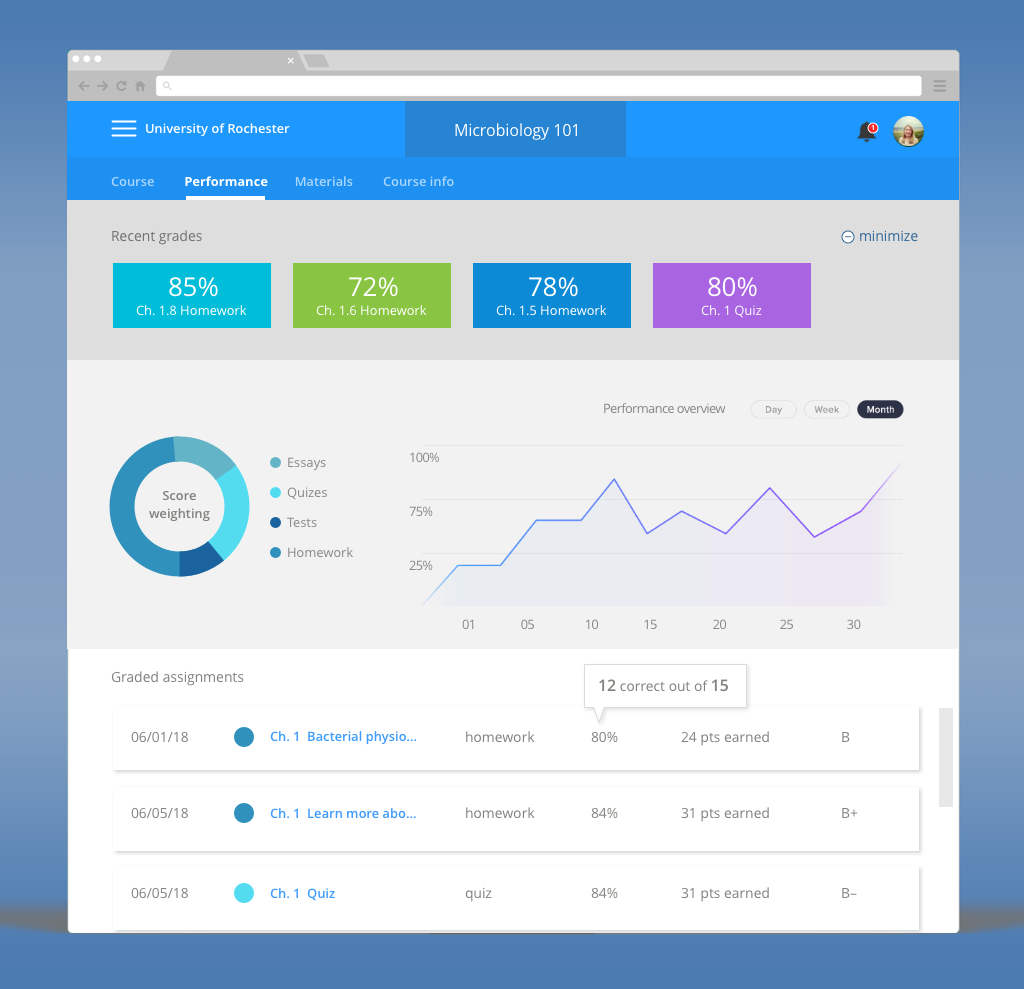
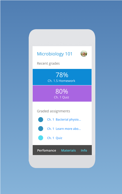
A static dashboard treated every student identically regardless of where they actually stood. I designed it to adapt to each student's progress and deadlines: catch-up resources for students falling behind, enrichment material for students ahead, and a "Your Week at a Glance" view that adjusts by day. Since 60% of access was on mobile, this had to work mobile-first — a stacked card layout, touch-friendly targets, and persistent bottom navigation, with desktop as the enhancement rather than the default. I also moved grade and progress indicators into a persistent, glanceable header so students didn't have to go looking for reassurance about where they stood.
Information Architecture
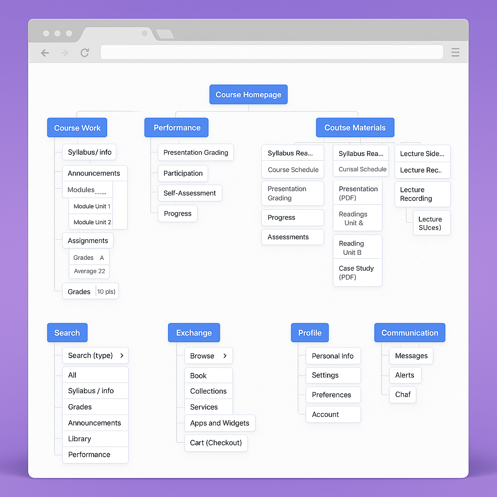
The original structure split Dashboard, Assignments, Materials, Grades, and Resources into five siloed sections nested 4-5 levels deep. I rebuilt it around action rather than category — Dashboard, Your Week, In Progress, Completed, and Course Materials — with grades and materials surfaced contextually inside each assignment instead of hidden in their own tabs, cutting navigation down to 2-3 levels.
Testing & Iterations
I ran two rounds of moderated usability testing with 8 students. The first round surfaced three issues: an easy-to-miss "View All" link, unclear required-vs-optional materials, and performance indicators that read as accusatory — students with lower grades found the red color coding stressful rather than motivating. I softened the palette, added encouraging messaging regardless of performance, and emphasized trend over absolute grade; the second round validated the fixes across every core task.
Outcomes & Impact
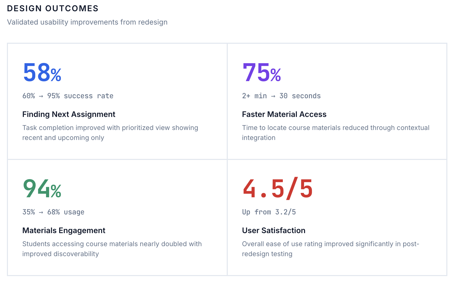
Task completion for finding the next assignment went from 60% to 95%. Materials access rose from 35% to 68% of students, on-time submission from 75% to 88%, and mobile completion from 45% to 72%. Overall satisfaction moved from 3.2/5 to 4.5/5.
"I used to feel lost every time I logged in. Now I know exactly what to do."
"I love that I can see I'm on track without clicking around forever."