Design System Leadership
Building consistency and efficiency at scale
Impact at a Glance
Reduced Design-to-Dev time by 40%
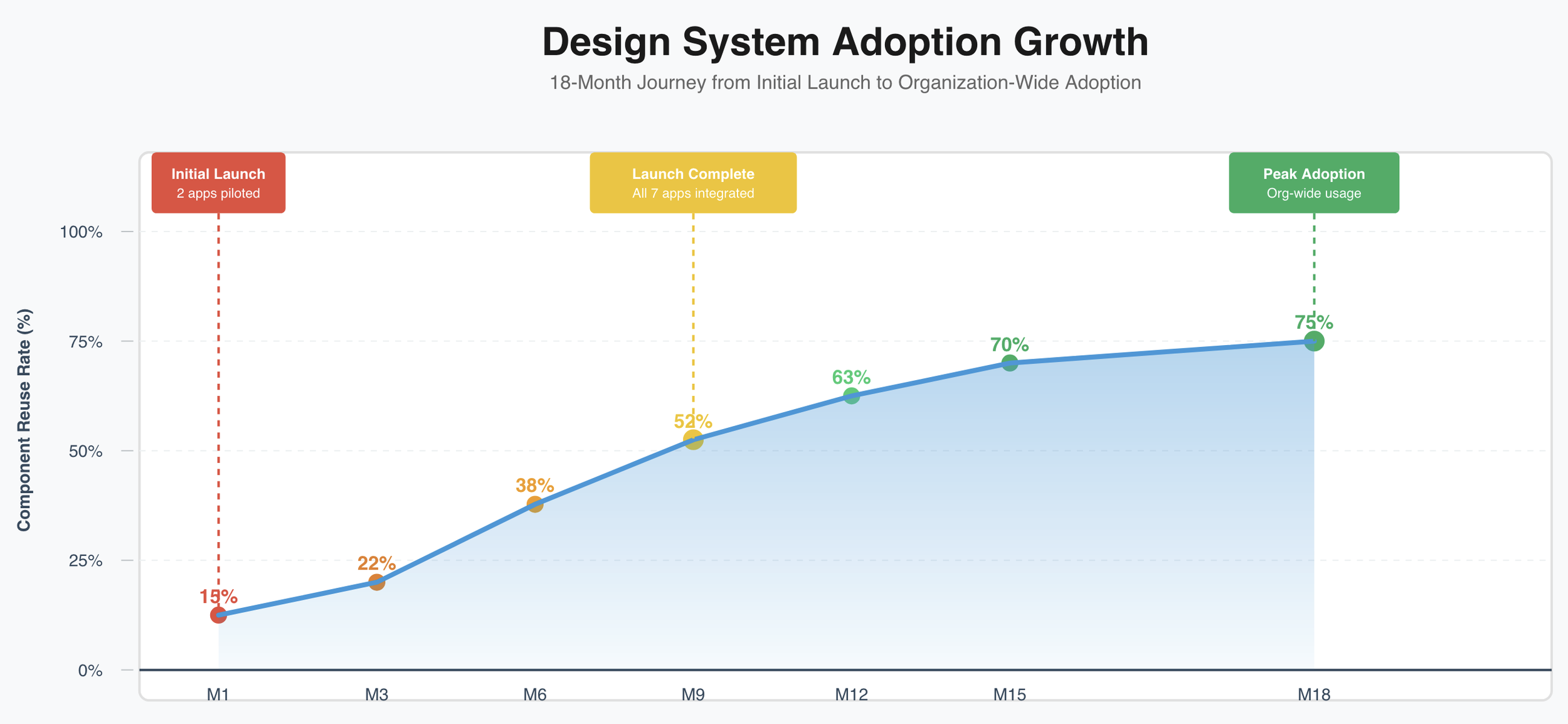
Increased component reuse from 15% to 75%
Decreased UI inconsistencies by 85% across 7 applications
Scaled system from 7 to 9 apps without additional design resources
The Challenge
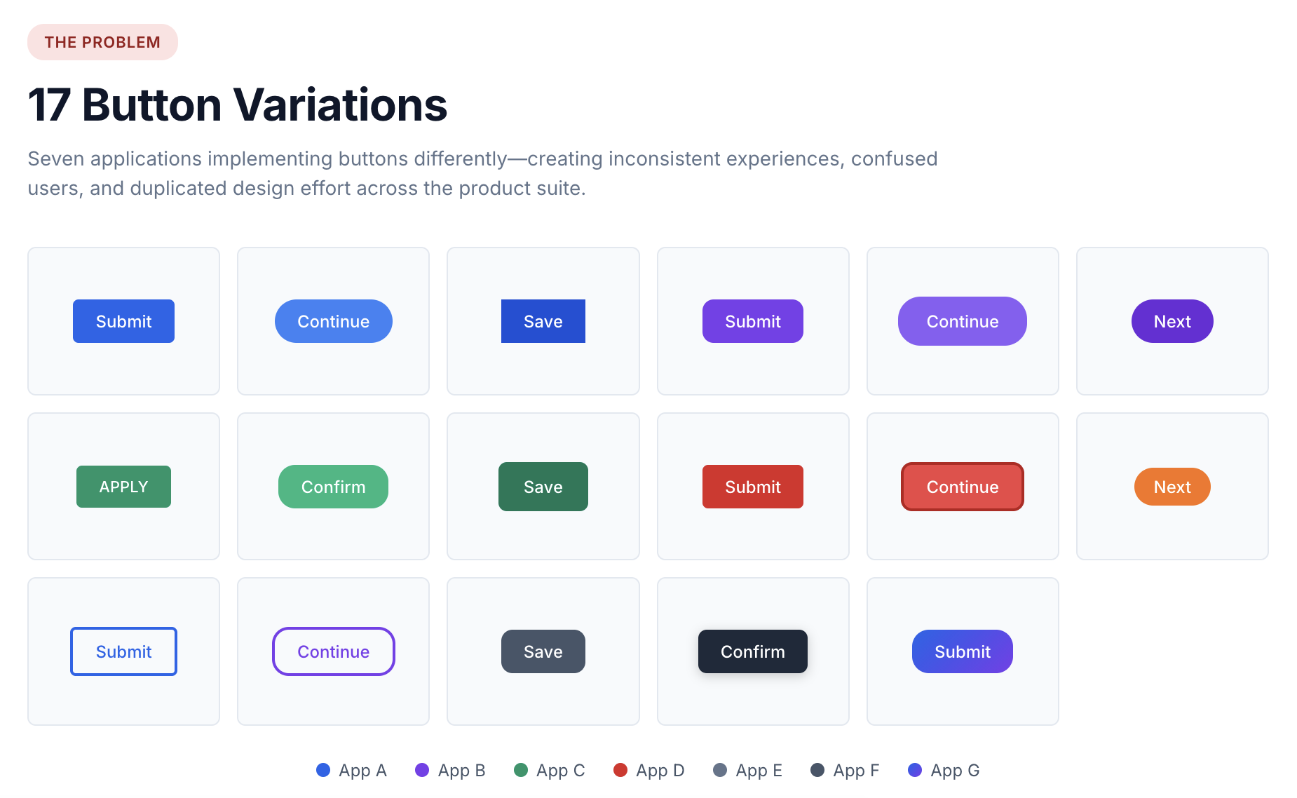
Seven Air Force apps operated independently with no shared design standards: 17 different button variations, inconsistent interactions, and design-to-dev hand-offs averaging two weeks per feature. An audit found 85% of components were being recreated from scratch by different teams. I built the case for a comprehensive Design System by showing how much that inconsistency was costing the organization in rework.
My Approach
Research & the case for change
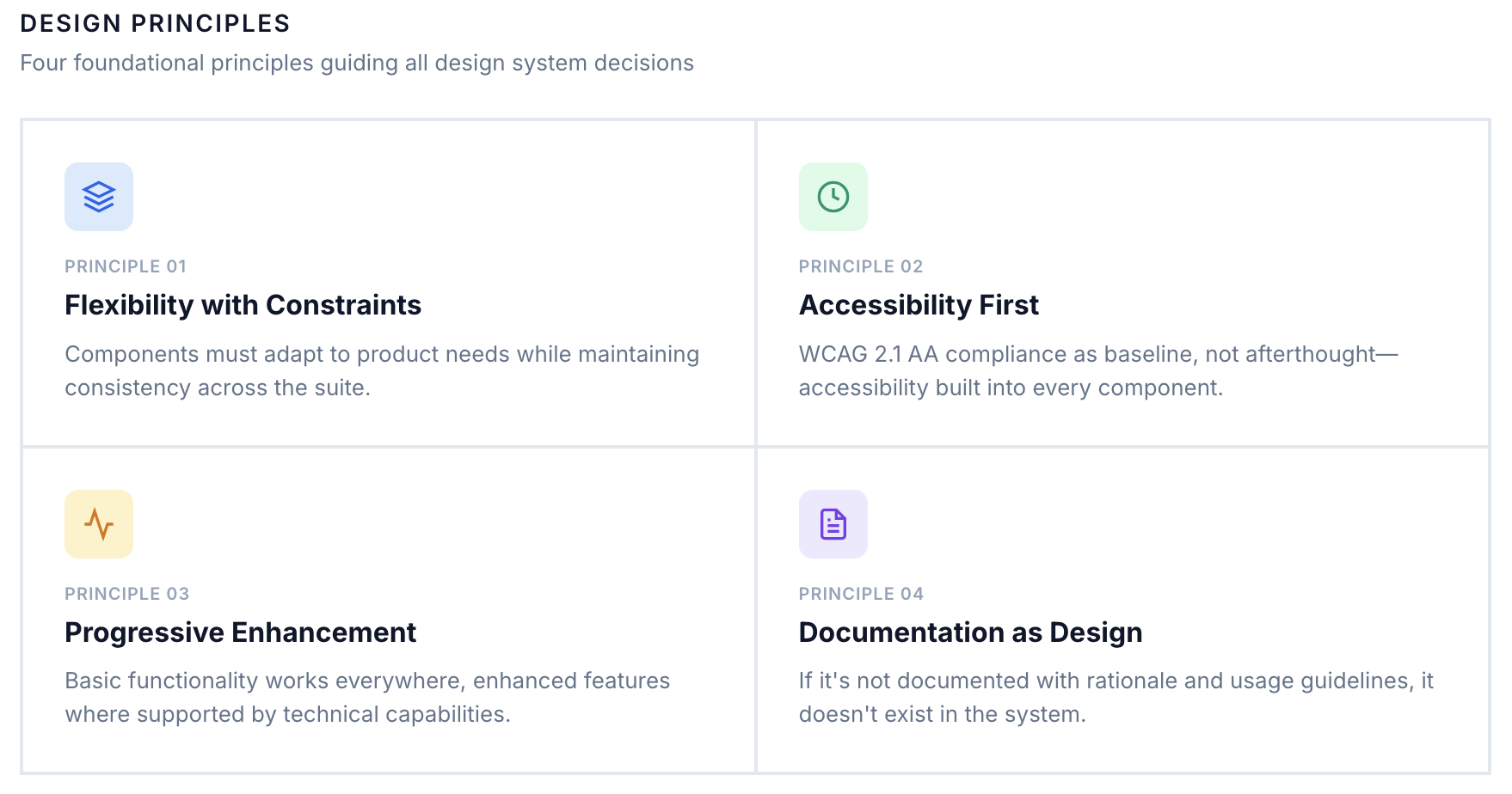
I audited all 7 apps, documenting every component, pattern, and interaction, then synthesized the findings into the business case for a shared Design System. Four principles — flexibility with constraints, accessibility first, progressive enhancement, and documentation as design — guided every decision from there forward.
Architecture & governance
I designed a three-tier system: a Foundation layer for shared styles, a Component layer of 45 core components with Figma-override customization, and a Pattern layer for complex workflows — flexible enough for teams to adapt without recreating the fragmentation that produced 17 different buttons in the first place.
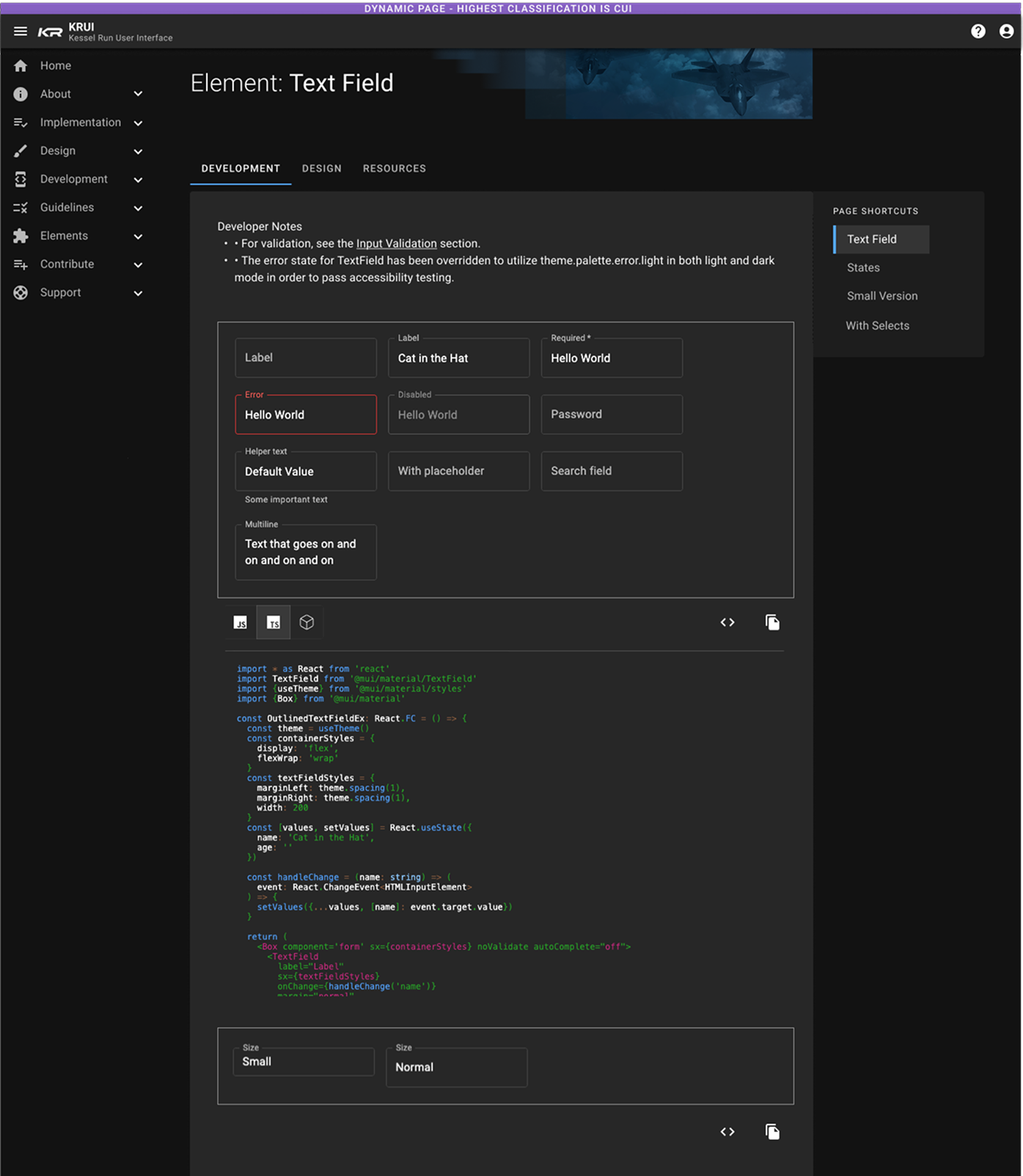
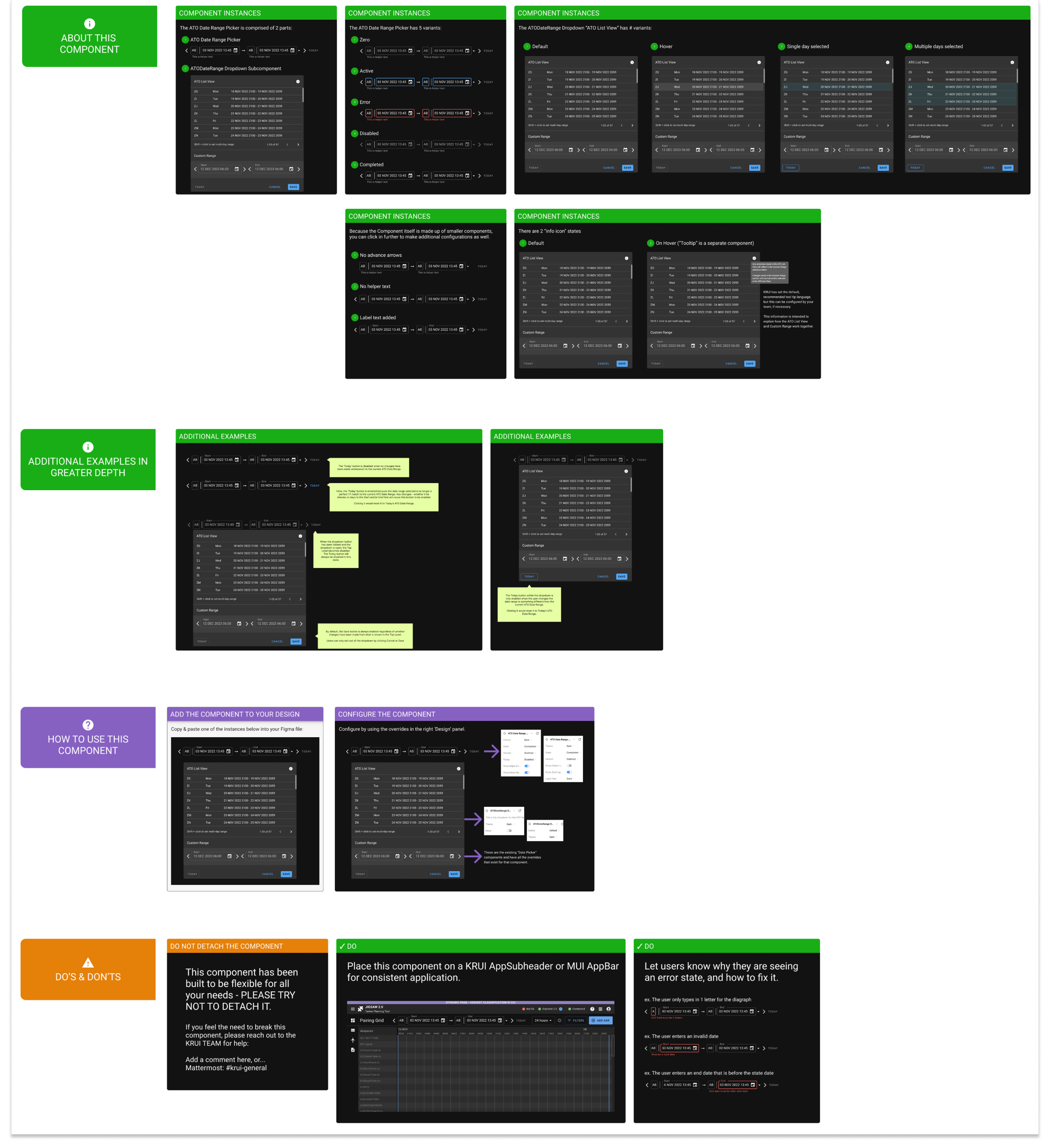
Documentation went beyond visual specs to cover interaction behavior, accessibility requirements, and the reasoning behind each decision, so teams understood not just how to use a component, but why it worked that way.
Governance ran on a simple contribution process (propose, review, design sprint, ship with documentation) and a small set of decision criteria: default to consistency, meet WCAG 2.1 AA as a floor, and ask whether a choice would still hold at 20 apps instead of 7.
Rolling it out
I rolled the system out in phases, starting with two engaged teams to surface issues early, then expanding with proven patterns before mandating adoption org-wide. Training materials, workshops, and office hours cut integration time from two weeks to two days per application.
Working with engineering
I partnered with our 5-person dev team to build the component library in code, using MUI as a foundation with extensive customization, weekly design reviews, and shared documentation in GitLab so design and engineering worked from the same source of truth. When a technical constraint conflicted with the design vision, I redesigned within the constraint rather than forcing an impossible build, a pragmatic approach that built trust and better outcomes.
Outcomes & Impact
System Evolution
The Design System kept evolving after launch, growing from 45 to 49 components in 12 months, with two teams contributing new components monthly and library downloads up 300% as adoption spread. It became the model other cross-functional initiatives followed.
Creating a Figma Component
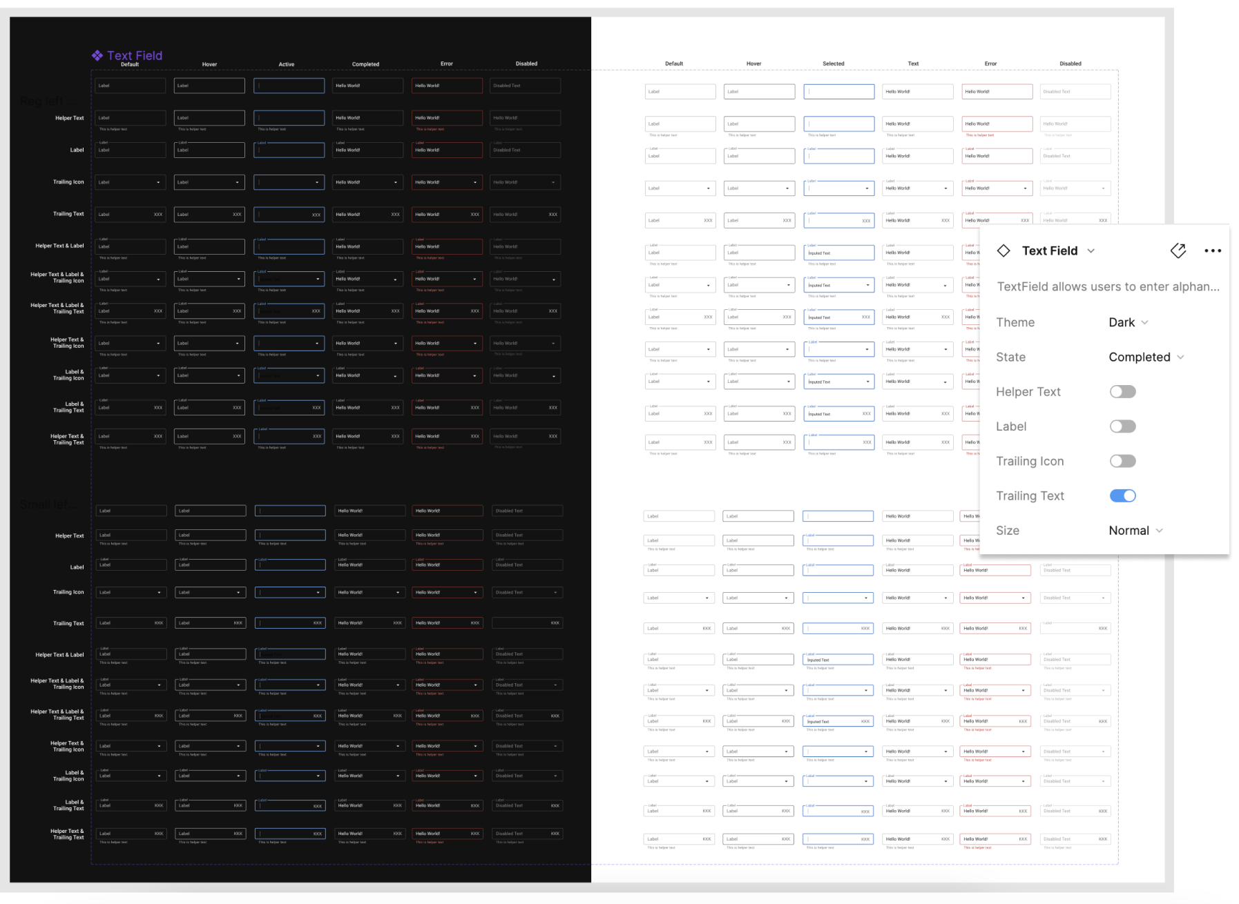
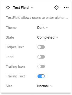
Figma allows designers to create components, such as buttons, that can be customized through selectable overrides. During this phase, I collaborated with two other designers to completely rebuild all components within a new Figma component library. We included a full range of style options, enabling teams to easily customize components to fit the specific needs of their applications.
Below is an example of the text field component, along with the available overrides: