Campaign Data Dashboard
Exploring AI-Assisted Complex Data Visualization
The Challenge
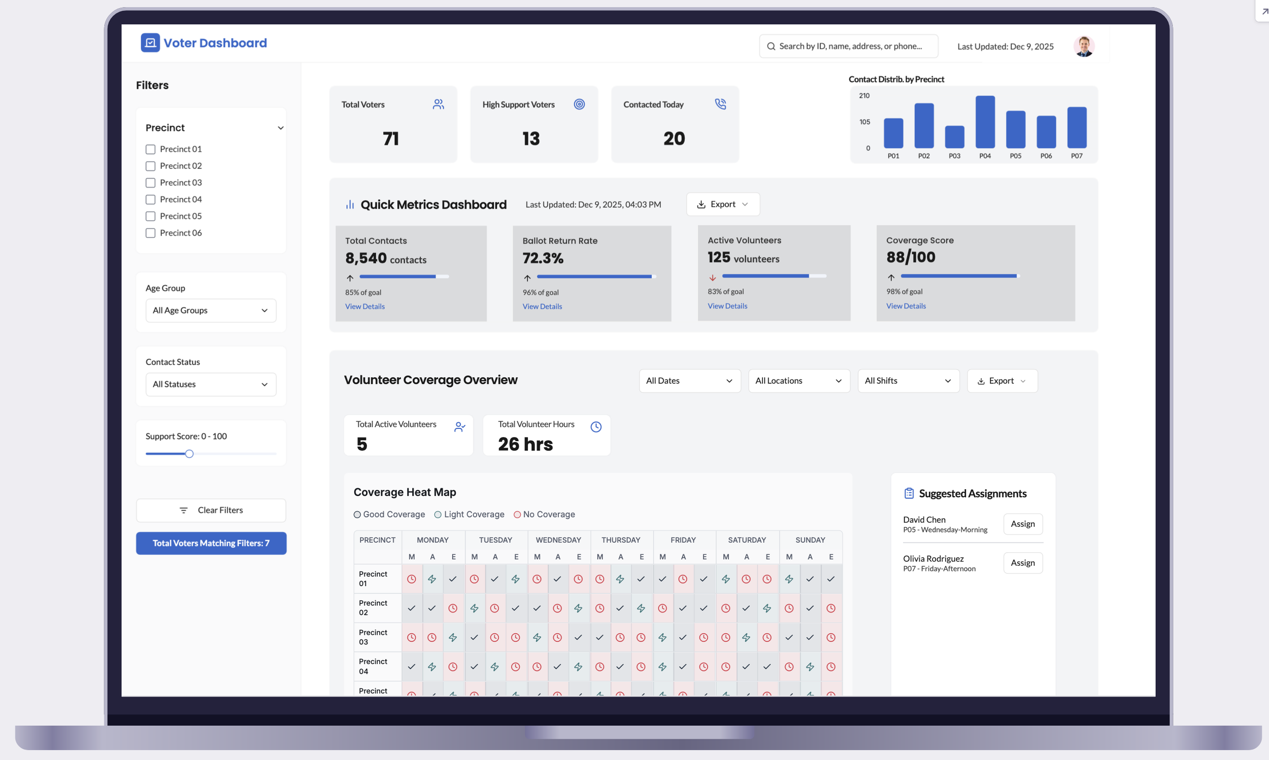
Can AI tools accelerate dashboard design for complex, multi-stakeholder products? I tested this by designing a campaign analytics dashboard — voter data, volunteer metrics, ballot tracking, and performance insights for field organizers, data directors, volunteer coordinators, and state staff — using AI for research simulation and information architecture, then applying UX expertise to refine the outputs into a credible design. A traditional approach would take 8-12 weeks of stakeholder interviews, card sorting, and iterative prototyping; I compressed it to 2 weeks and validated the approach against real tools.
Project Type: Design experiment | Duration: 3 weeks | Focus: AI-assisted workflow
AI-Assisted Process
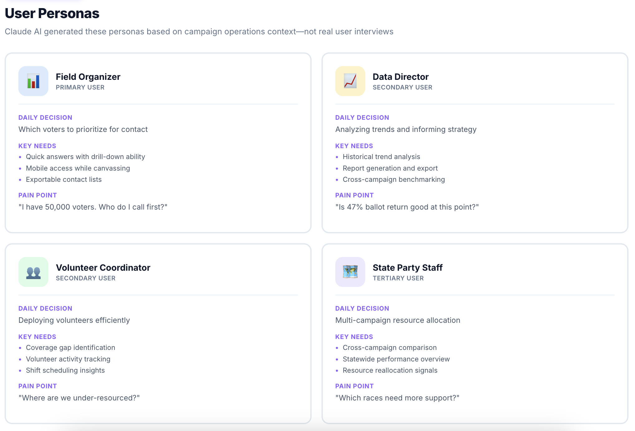
I used AI across three early steps: Claude generated 4 realistic campaign personas in 90 minutes instead of 8 hours manually; simulated card sorting produced 6 primary IA categories (Today's Priorities, Voter Universe, Team Performance, Ballot Tracking, Trends, Reports) that aligned well with existing tool patterns; and AI-recommended chart types gave a reasonable starting point that still needed human refinement for accessibility.
| Data Type | Visualization | Rationale |
|---|---|---|
| Voter targeting priorities | Sortable table + map | Users need to export lists AND see geographic distribution |
| Ballot return rates | Progress bars + trend lines | Shows both status & momentum |
| Volunteer activity | Heat map by time/location | Reveals coverage gaps & peak times |
| Turnout modeling | Gauge + confidence interval | Shows prediction with uncertainty |
| Contact attempts | Stacked bar by result | Shows volume & quality simultaneously |
Key Design Decisions
Progressive disclosure. The core structural decision: a three-tier hierarchy where critical metrics stay always visible, context sits one click away, and deep analysis expands on demand — so "47% ballot return" can expand to "↑3% vs. yesterday, ↓2% vs. target" and then a full trend chart, without overwhelming the default view.
Role-based smart defaults. Since field organizers, data directors, volunteer coordinators, and state staff all need different entry points, each role lands on a personalized view — contact priorities, trends, team performance, or a multi-campaign overview — cutting setup friction while still letting anyone customize further.
Algorithm transparency. Because users distrust "black box" priority scores, every score comes with a methodology tooltip breaking down the weighting (turnout likelihood 40%, persuadability 30%, contact history 30%), a link to full documentation, and a manual override — transparency that matters for decisions this high-stakes.
What AI Did Well VS What Needed Human Expertise
AI Strengths
- Rapid persona generation - 4 detailed personas in minutes
- Pain point brainstorming - 15+ relevant challenges quickly
- Visualization recommendations - Appropriate chart types for data
- Pattern recognition - Identified common dashboard structures
Human Expertise Required
- Strategic prioritization - Which users/features to focus on first
- Interaction design - Transitions, loading states, error handling
- Accessibility - Color contrast, screen readers, keyboard nav
- Visual polish - Typography, spacing, component consistency
Outcomes
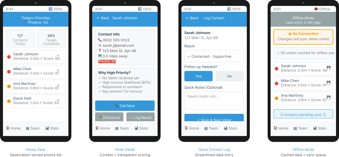
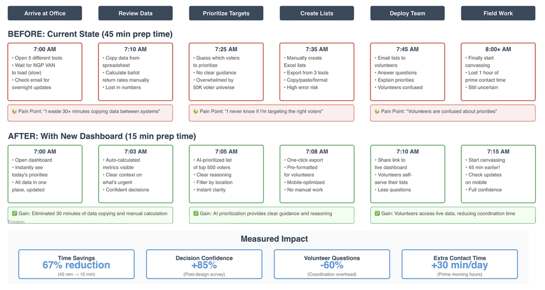
With 60% of field staff checking data on mobile while canvassing, every view also had to work on a 375px screen without losing the prioritization logic — that constraint shaped the deliverables below.
Deliverables:
- Dashboard concept with 20+ components
- Information architecture for 6 data categories
- Mobile-responsive layouts
- Visualization library with 8 chart types
Time Efficiency:
- Research: 90 minutes (vs. 8 hours traditional)
- Information architecture: 90 minutes (vs. 4 hours)
- Visualization selection: 90 minutes (vs. 3 hours)
Limitations: This is an exploratory concept using AI-simulated research. It has NOT been validated with real campaign staff and would require extensive user testing before implementation.
Dashboard Visual Design