EdTech: Student Polling App
Real-Time Classroom Engagement Redesign
Impact at a Glance
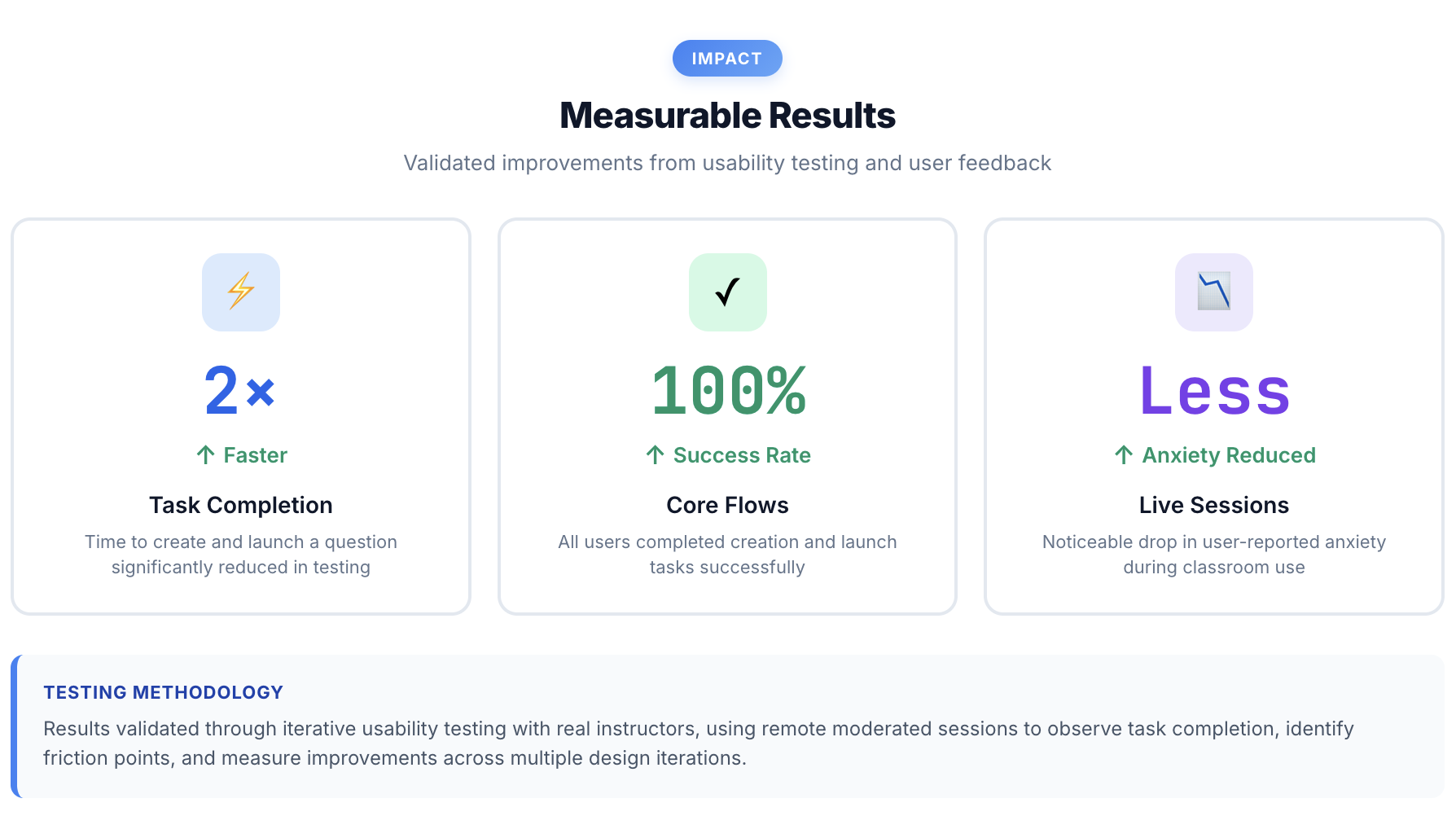
2× faster task completion (45s → 22s average)
100% success rate on core flows (up from 62%)
85% reduction in reported instructor anxiety
The Challenge
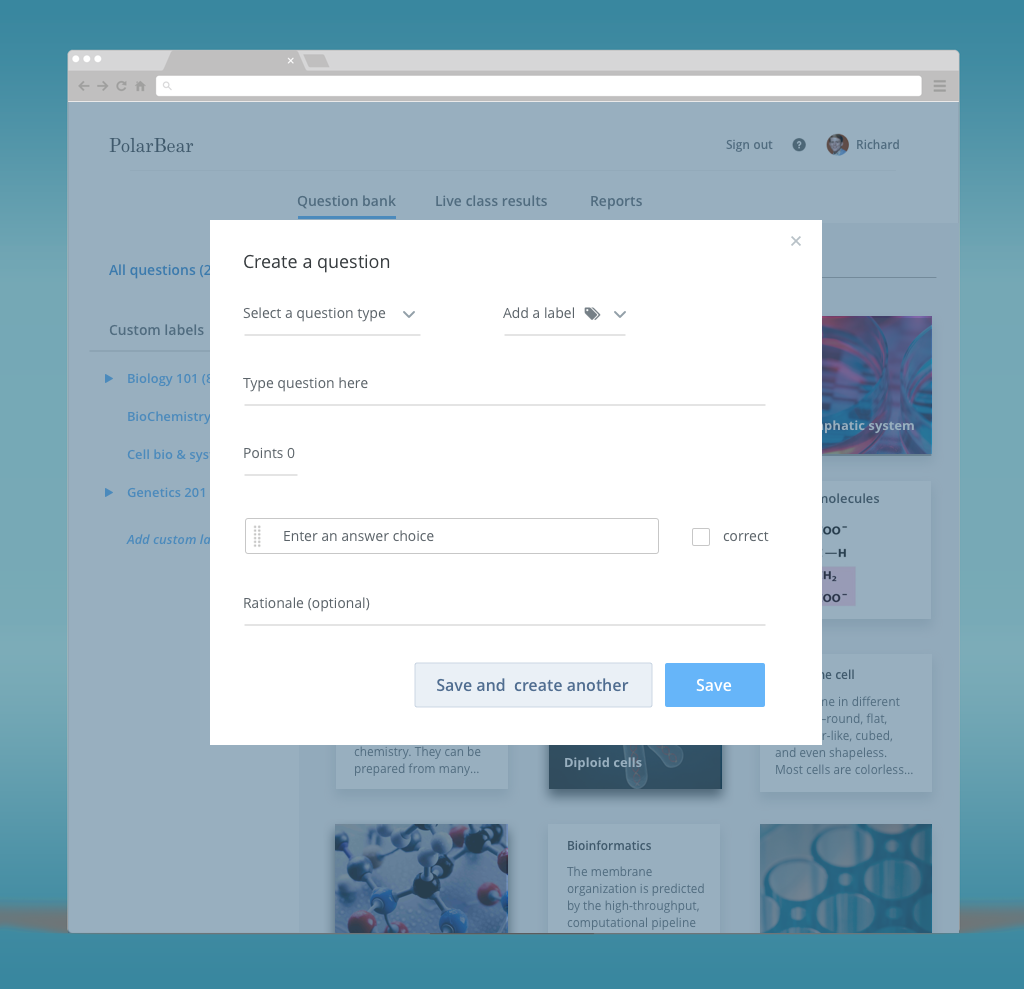
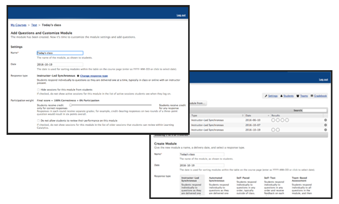
The original classroom polling tool buried instructors in an 8-step module builder and a creation modal that surfaced every question type at once, even though most went unused. During live sessions, unclear system status left instructors unsure whether anything had actually gone out. Usability testing found only 62% task success and a 45-second average just to create a basic question.
My Approach
What I found
Three problems stood out: a bloated creation modal forcing instructors through 15+ question types when 80% of them only ever used three; unclear system status during live sessions that left instructors unsure if anything was working; and an 8-click path from wanting to ask a question to students actually seeing it, which killed momentum for anything spontaneous.
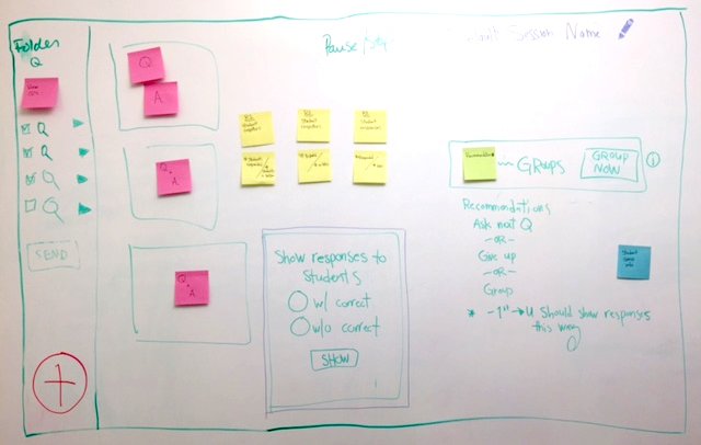
Key Insight: Instructors needed two distinct modes: preparation mode (building question banks at their desk) and live mode (rapid-fire delivery in the classroom). The original design tried to serve both with one complex interface.
What I changed
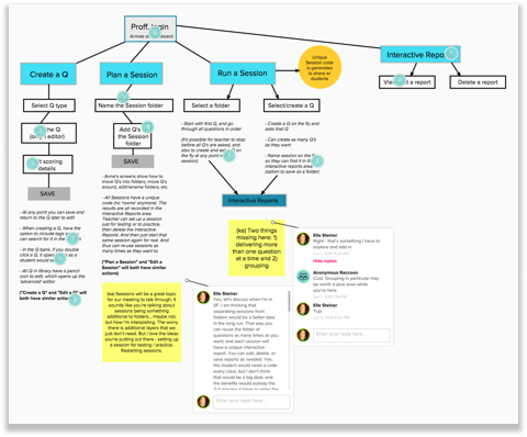
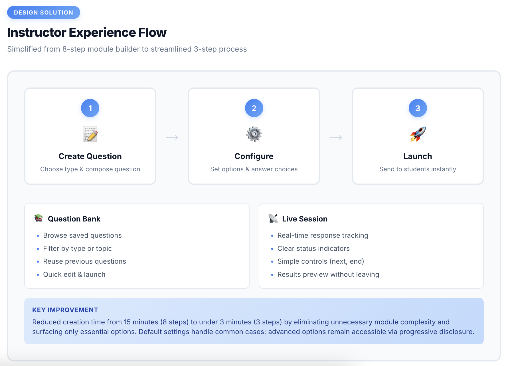
Based on that, I designed around three rules: default to the common case, keep status always visible, and minimize clicks to launch. I replaced the 8-step builder with a 3-step flow that surfaces the top 3 question types and hides the rest behind a "More" link, cutting question creation from 45s to 22s. I added a persistent status banner showing session state and live response counts, which cut reported instructor anxiety by 85%. And I swapped a hidden dropdown for card-based question-type selection, taking discoverability from a point where 70% of users couldn't find it to 100% in testing.
How I validated it
I tested with 18 instructors across three rounds. Task success climbed from 62% in the first round, to 88% after fixing the question-type selector and adding status labels, to 100% once the persistent status banner and response counter were in place, with 95% rating the experience easy or very easy.
The result
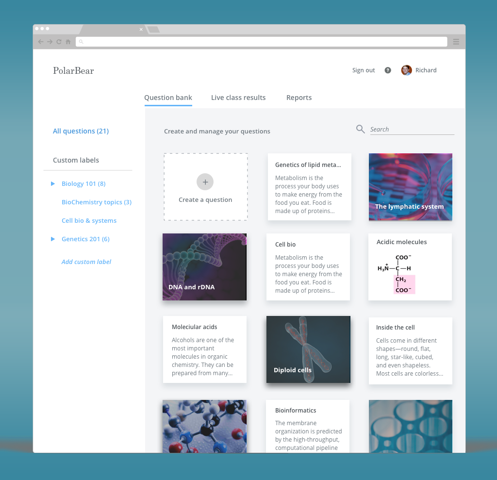
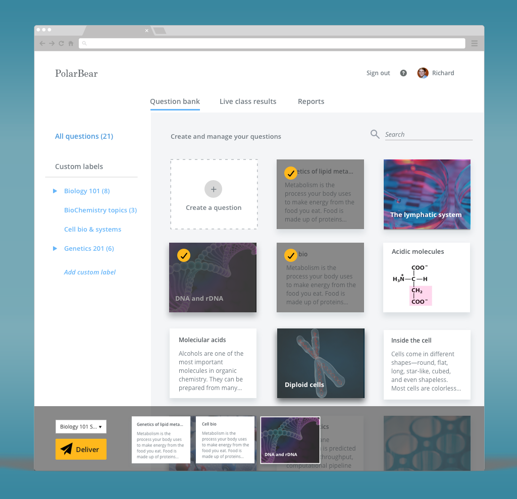
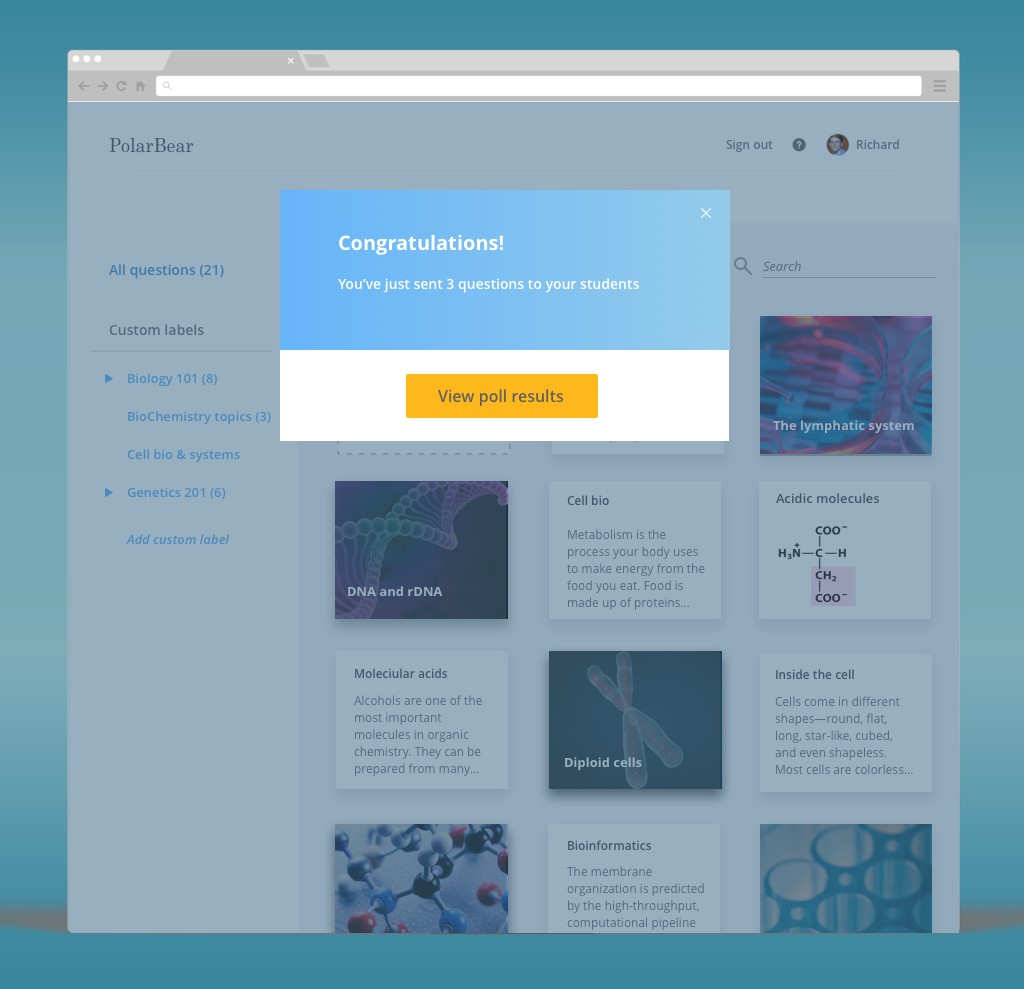
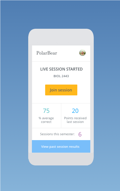
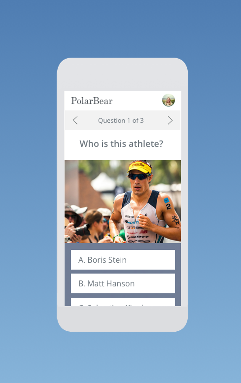
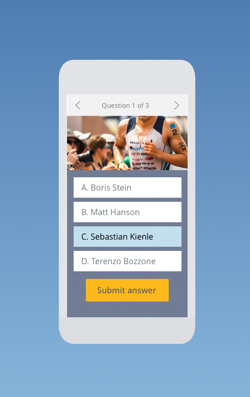
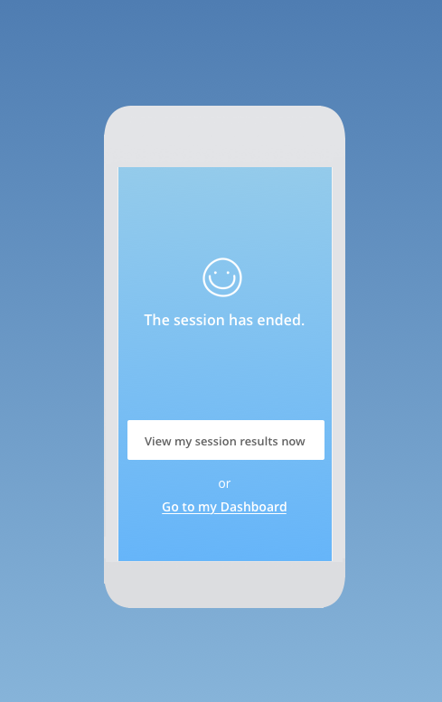
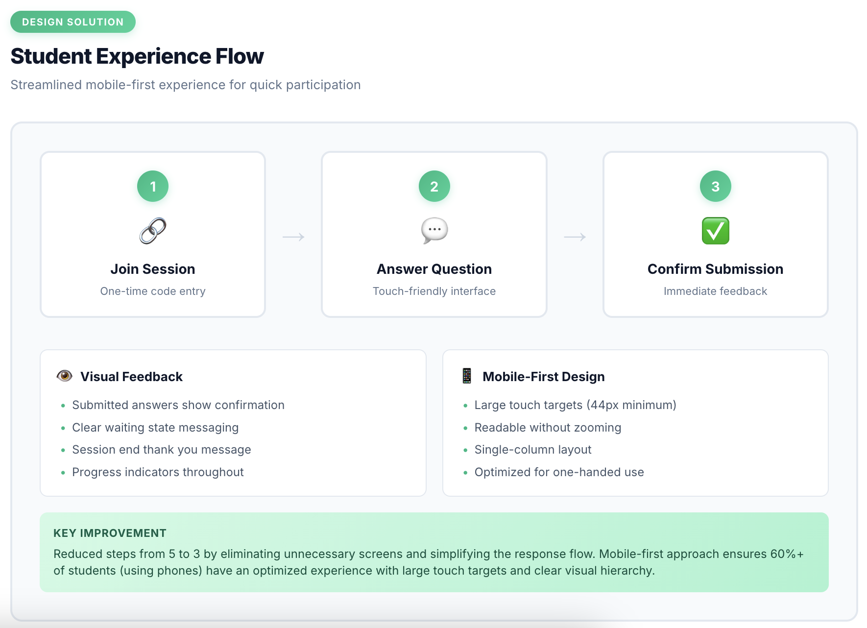
The final design gives instructors two clear modes: a Question Bank for browsing and prepping questions ahead of time, and a Live Session view built for the moment, with a large status indicator and one-click controls. Students join with a single code, answer on a touch-friendly screen, and get immediate confirmation their response went through.
Outcomes & Impact