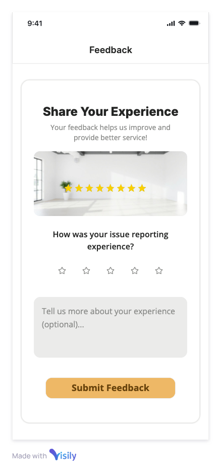
Mobile Property Reporting App
Exploring AI-Assisted Rapid Prototyping
The Experiment
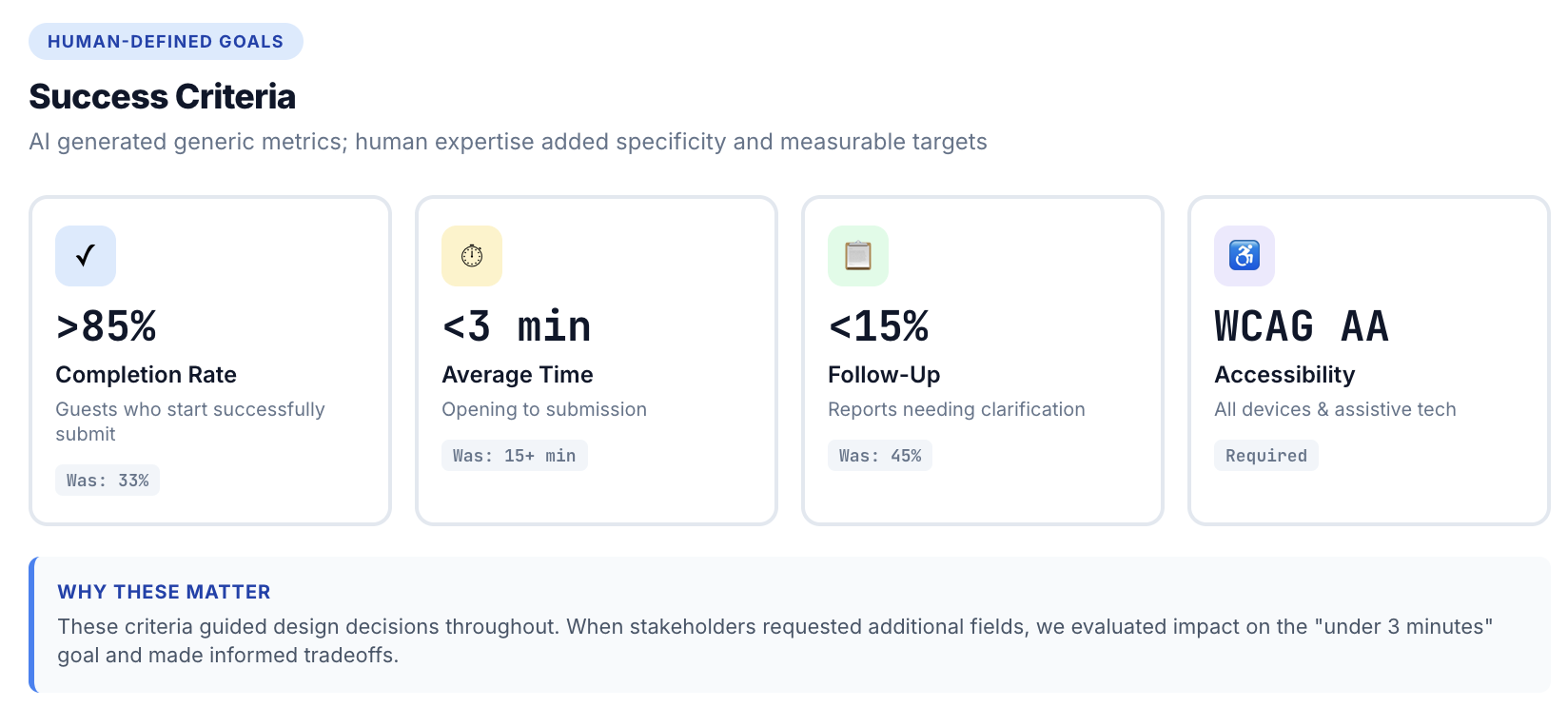
Can AI tools accelerate the UX design process from concept to testable prototype without sacrificing quality? I explored this by designing a mobile issue-reporting flow for short-term rental guests, who often hit friction reporting property issues through systems that require account creation, complex navigation, and lengthy forms. The goal: a login-free, mobile-first experience that cuts reporting time from 15+ minutes to under 3.
Project Context: Design exploration | Duration: 2 weeks | Role: Solo designer using AI tools
The AI-Assisted Approach
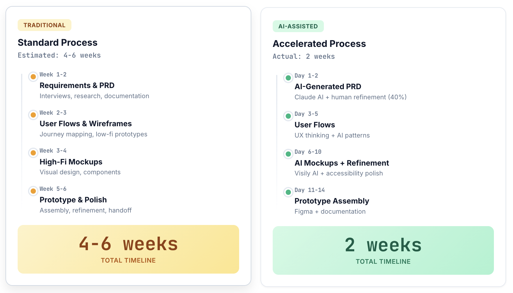
I used Claude for requirements and user stories, Visily for rapid mockups from text prompts, and Figma for final refinement and prototyping — compressing what would typically be a 4-6 week process into 2 weeks, a 70% time reduction, though the results weren't validated with real users.
Phase 1: AI-Generated PRD
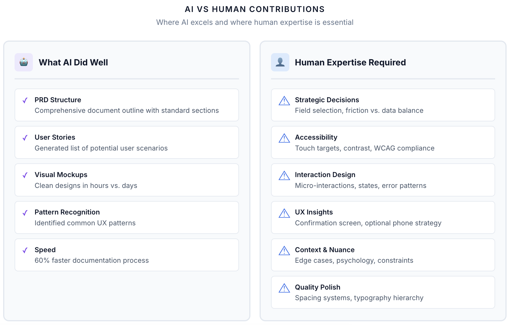
I prompted Claude to generate a full PRD from the problem space, user needs, and technical constraints — it nailed the structure, user stories, and technical requirements, but its success metrics were generic and it missed edge cases, accessibility considerations, and a rollout strategy, so I refined the criteria myself (85%+ completion rate, under 3 minutes, accessible across devices). AI accelerates documentation, but human domain expertise adds the critical depth: I spent about 40% of the time I would have spent writing from scratch, and added 50% more value through refinement.
Phase 2: User Flow Design
AI suggested initial flow ideas, but the actual design came from traditional UX thinking. Guests can reach the form via QR code, SMS, or email link — QR eliminates typing, the others cover accessibility — then complete it as a single-page scroll rather than a wizard, since research shows single-page forms complete better under 15 fields.
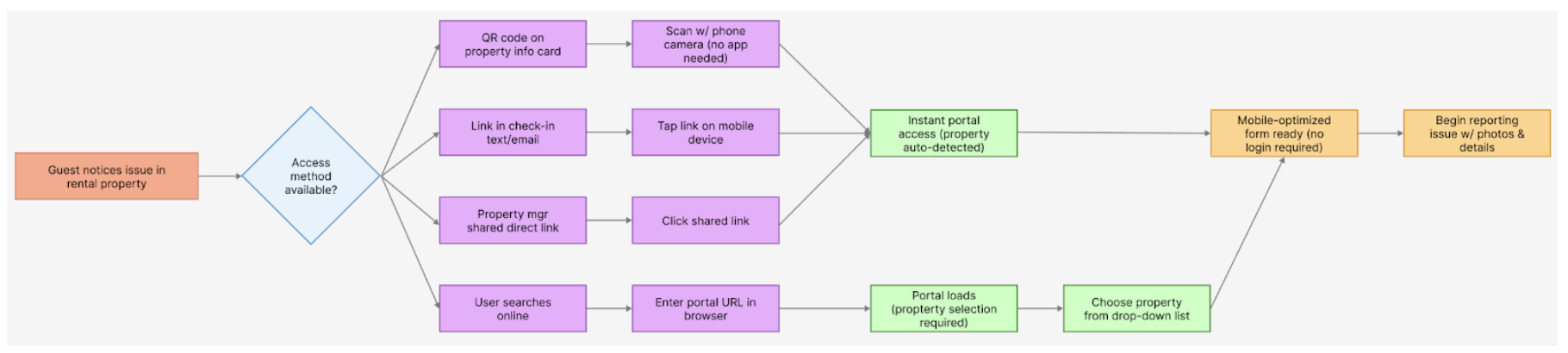
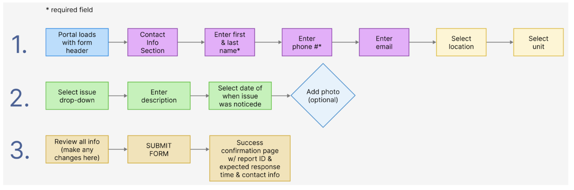
Three decisions shaped the rest: I skipped authentication entirely, since removing friction mattered more than tracking repeat reporters; I prioritized property code over address entry, with a visual guide and a fallback for guests who can't find it; and I made photo upload optional, capped at 5 images, so it wouldn't stall submissions on bad connections.
Phase 3: AI-Generated Mockups
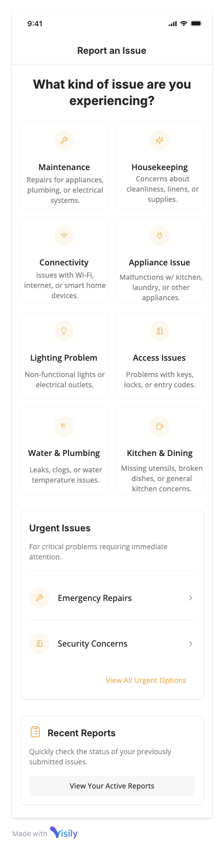
I gave Visily the PRD, flow diagrams, and design principles, and it generated mockups for 5 key screens in about 2 hours versus roughly 2 days by hand — clean and logically organized, but generic-looking, with inconsistent spacing and some accessibility gaps. About 6 hours of human refinement fixed touch targets, contrast ratios, spacing, typography, micro-interactions, and responsive breakpoints. AI generated roughly 70% of the mockup's value in 20% of the time, but the final 30% — polish, accessibility, interaction design — still took human craft.
Key Design Features
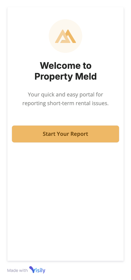
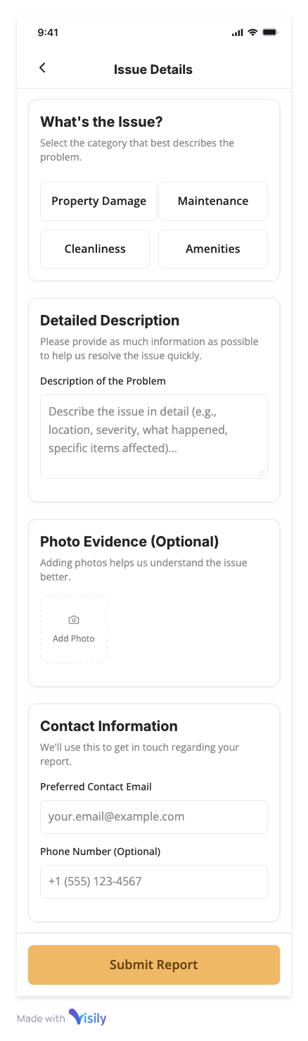
The final flow opens with a welcome screen that sets a 2-minute time estimate to reduce abandonment, a 4-step progress bar (Contact → Location → Issue → Review), and a form that makes phone optional — required phone fields cut completion by about 18%, so I made it optional with a benefit explanation instead — while prioritizing property code over address entry to avoid misrouted reports.
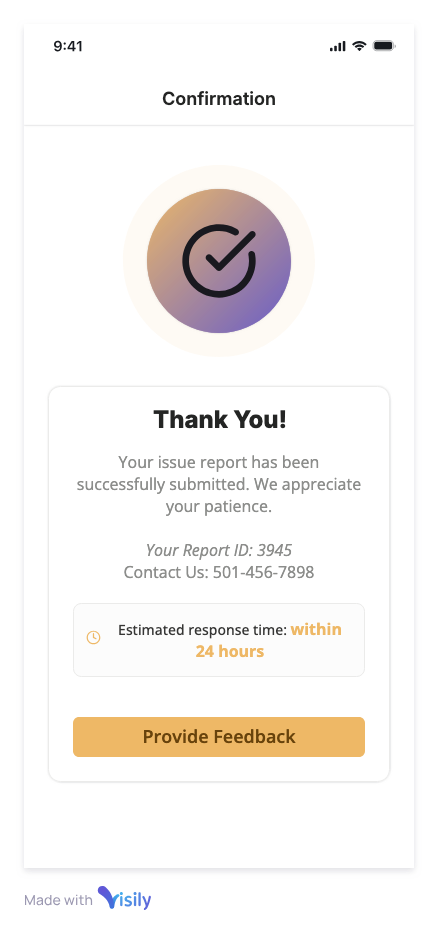
The confirmation screen wasn't in the original plan — it emerged during the mockup phase once I noticed guests would worry whether their report actually went through. It's the sharpest proof on this project that the best insights emerge during execution, not planning, and that AI tools don't surface them; human UX thinking does.
Designing with AI
AI compresses timelines on structure, not judgment. Documentation and initial mockups came together in a fraction of the usual time, but strategic decisions — which fields actually matter, how to balance structured versus free-text input, where accessibility standards apply — still needed human judgment; AI-generated designs routinely missed touch-target sizing, contrast ratios, and interaction nuance.
The best insights come from execution, not AI suggestions. The confirmation screen, the optional phone field, the property-code visual guide — none of these came from a prompt. They came from noticing what real use would actually feel like, which is still a human job.
App Screens